Guide
This guide demonstrates the usage of PairPlots and shows several ways you can customize it to your liking.
Set up:
using CairoMakie
using PairPlots
using DataFrames
CairoMakie is great for making high quality static figures. Try GLMakie or WGLMakie for interactive plots!
We will use DataFrames here to wrap our tables and provide pleasant table listings. You can use any Tables.jl compatible source, including simple named tuples of vectors for each column.
Single Series
Let's create a basic table of data to visualize.
N = 100_000
α = [2randn(N÷2) .+ 6; randn(N÷2)]
β = [3randn(N÷2); 2randn(N÷2)]
γ = randn(N)
δ = β .+ 0.6randn(N)

df = DataFrame(;α, β, γ, δ)| Row | α | β | γ | δ |
|---|---|---|---|---|
| Float64 | Float64 | Float64 | Float64 | |
| 1 | 7.68676 | 1.01022 | -0.285091 | 1.62789 |
| 2 | 4.18276 | -0.0594696 | -0.60381 | -0.47792 |
| 3 | 2.59308 | 2.94688 | 0.896706 | 1.71255 |
| 4 | 7.76624 | 5.1217 | 0.740281 | 5.04499 |
| 5 | 10.6594 | -0.106916 | 0.504516 | 1.48534 |
| 6 | 8.97745 | 4.09956 | -0.977068 | 4.45219 |
| 7 | 3.90375 | -3.56609 | 0.215673 | -5.04552 |
| 8 | 9.47013 | -5.89522 | -1.28603 | -6.7886 |
8×4 DataFrame
Row │ α β γ δ
│ Float64 Float64 Float64 Float64
─────┼───────────────────────────────────────────
1 │ 5.86784 0.676737 0.814249 0.6119
2 │ 5.20739 -2.95597 -1.70925 -3.11213
3 │ 5.58472 3.68555 1.82031 3.60586
4 │ 4.47898 -0.493841 -0.565474 -0.0699526
5 │ 8.39713 -2.13249 -1.55868 -1.81314
6 │ 5.30462 -4.24237 1.34437 -5.15687
7 │ 8.3575 -0.979077 2.84214 -1.66862
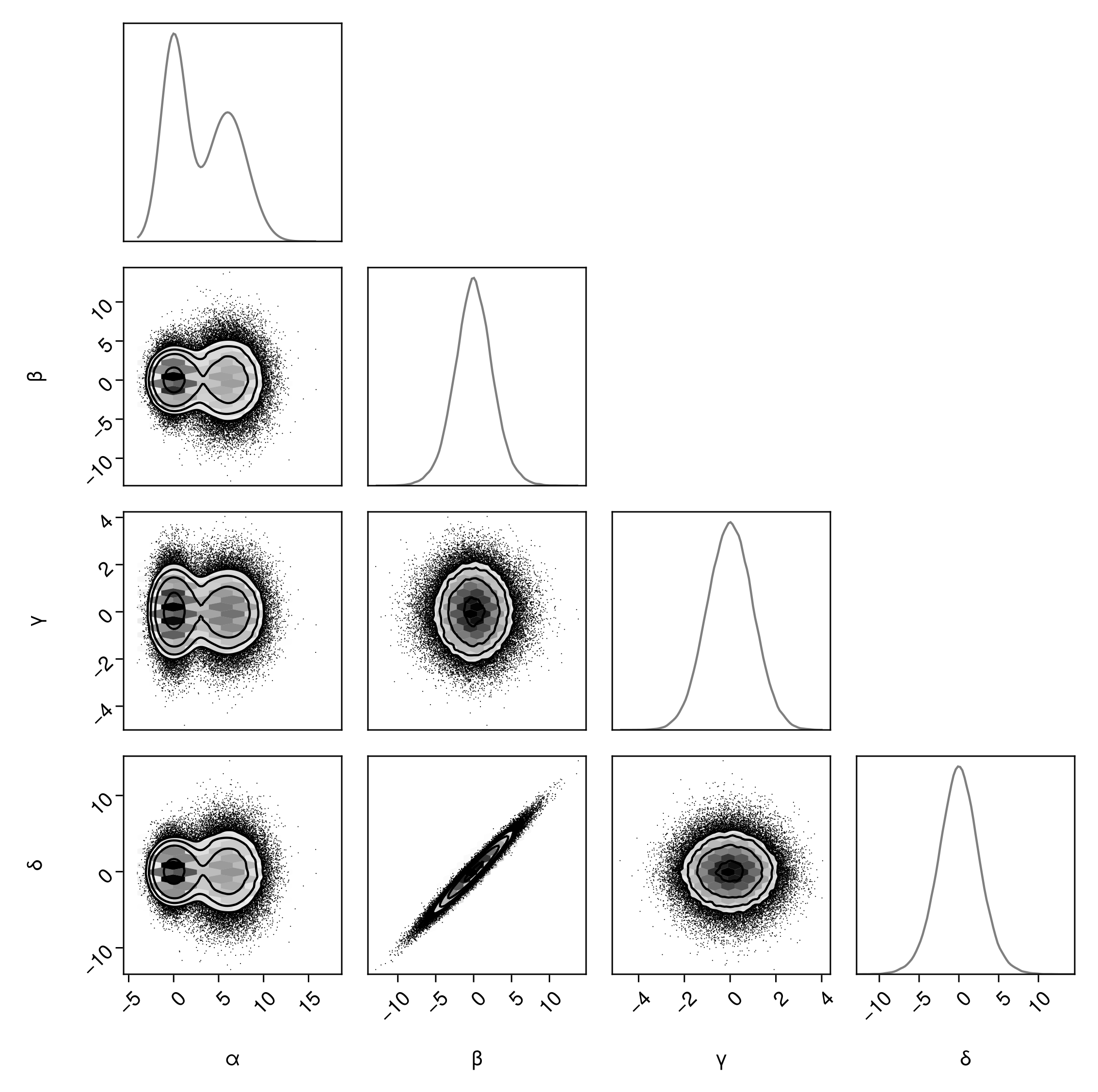
8 │ 6.20314 2.20745 -0.621868 2.07445We can plot this data directly using pairplot, and add customizations iteratively.
pairplot(df)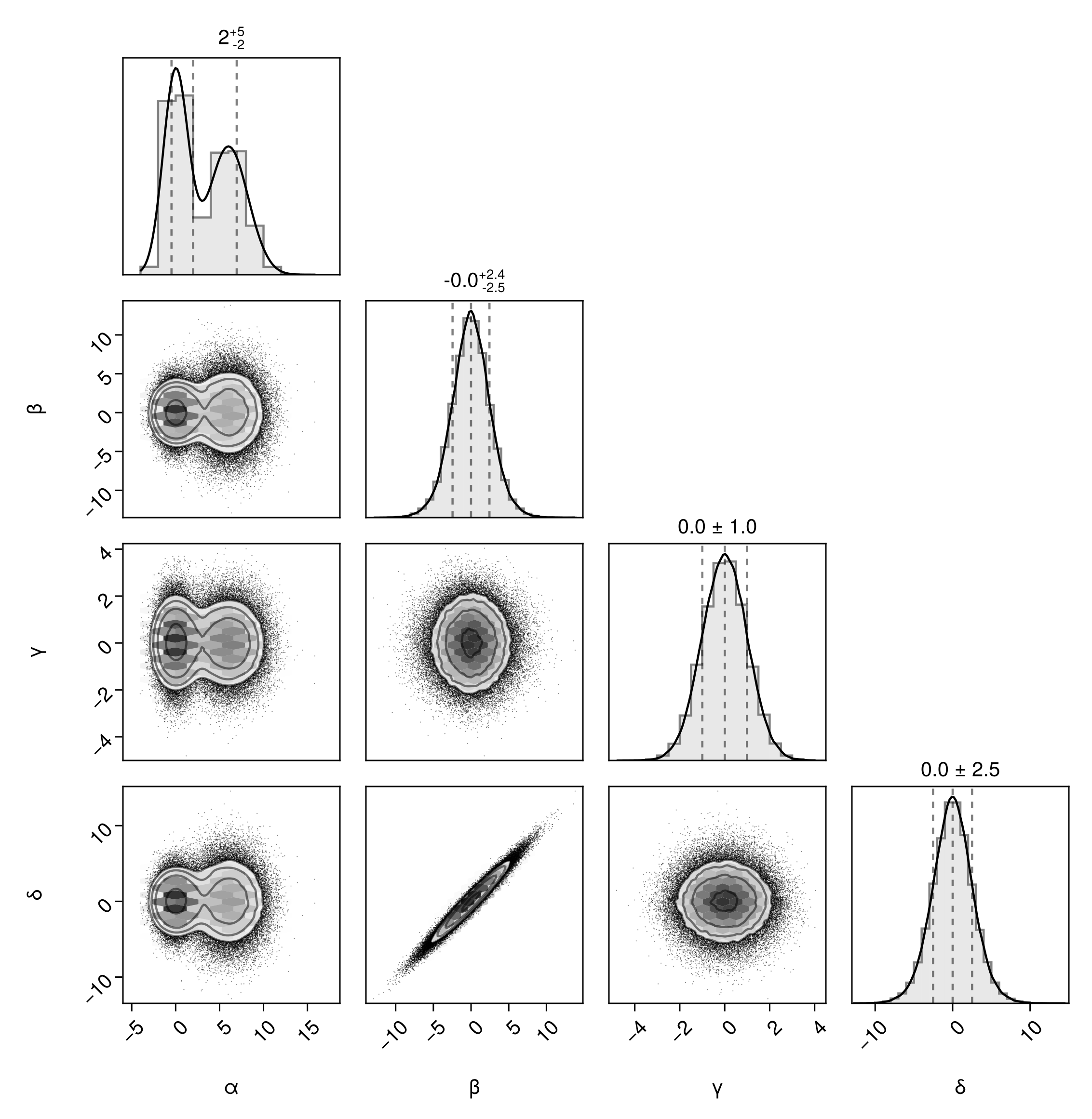
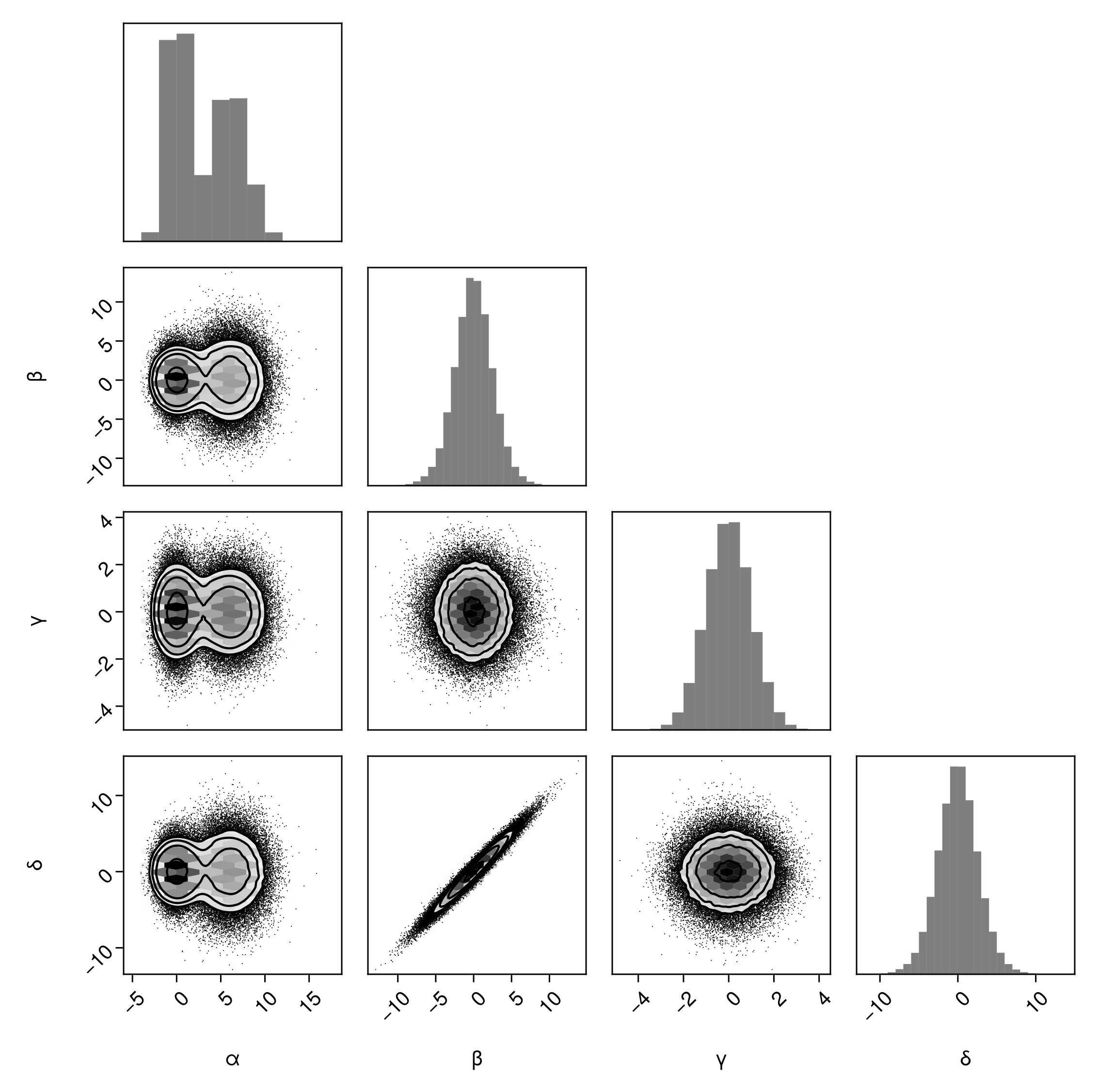
We can display a full grid of plots if we want:
pairplot(df, fullgrid=true)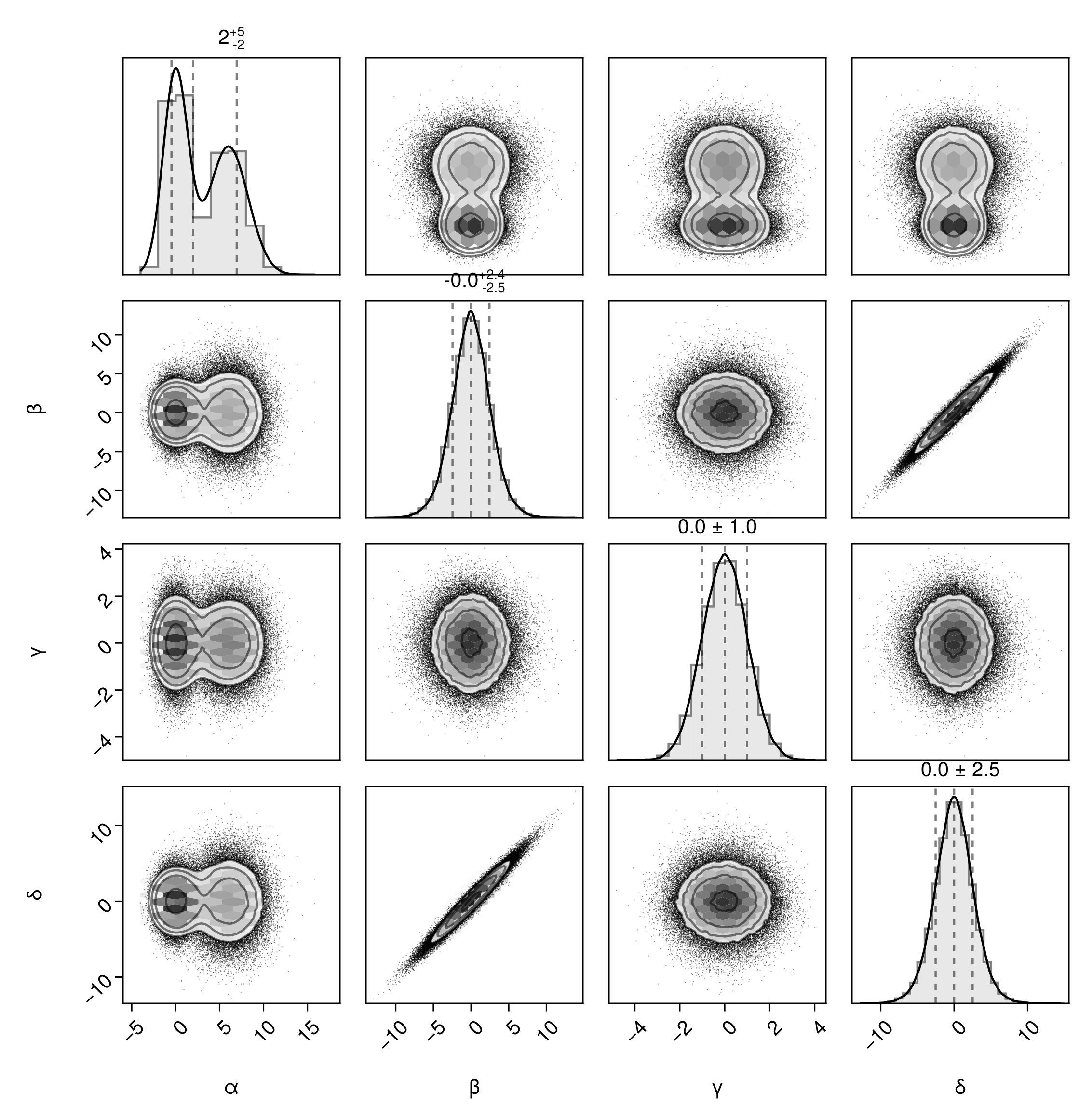
The fullgrid option is short for bottomleft=true and topright=true. We can specify these individually to create a top-right corner plot:
pairplot(df, bottomleft=false, topright=true)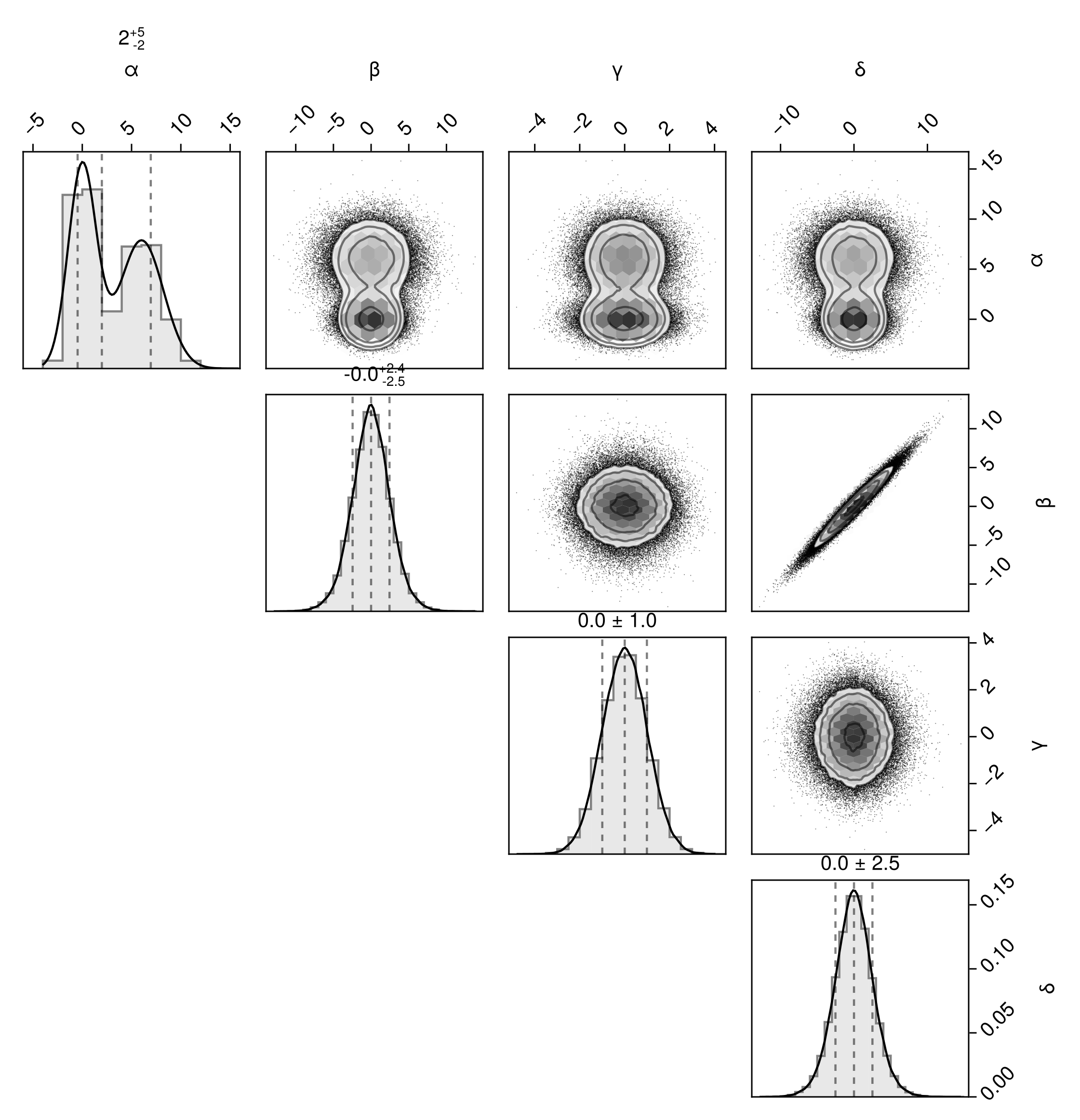
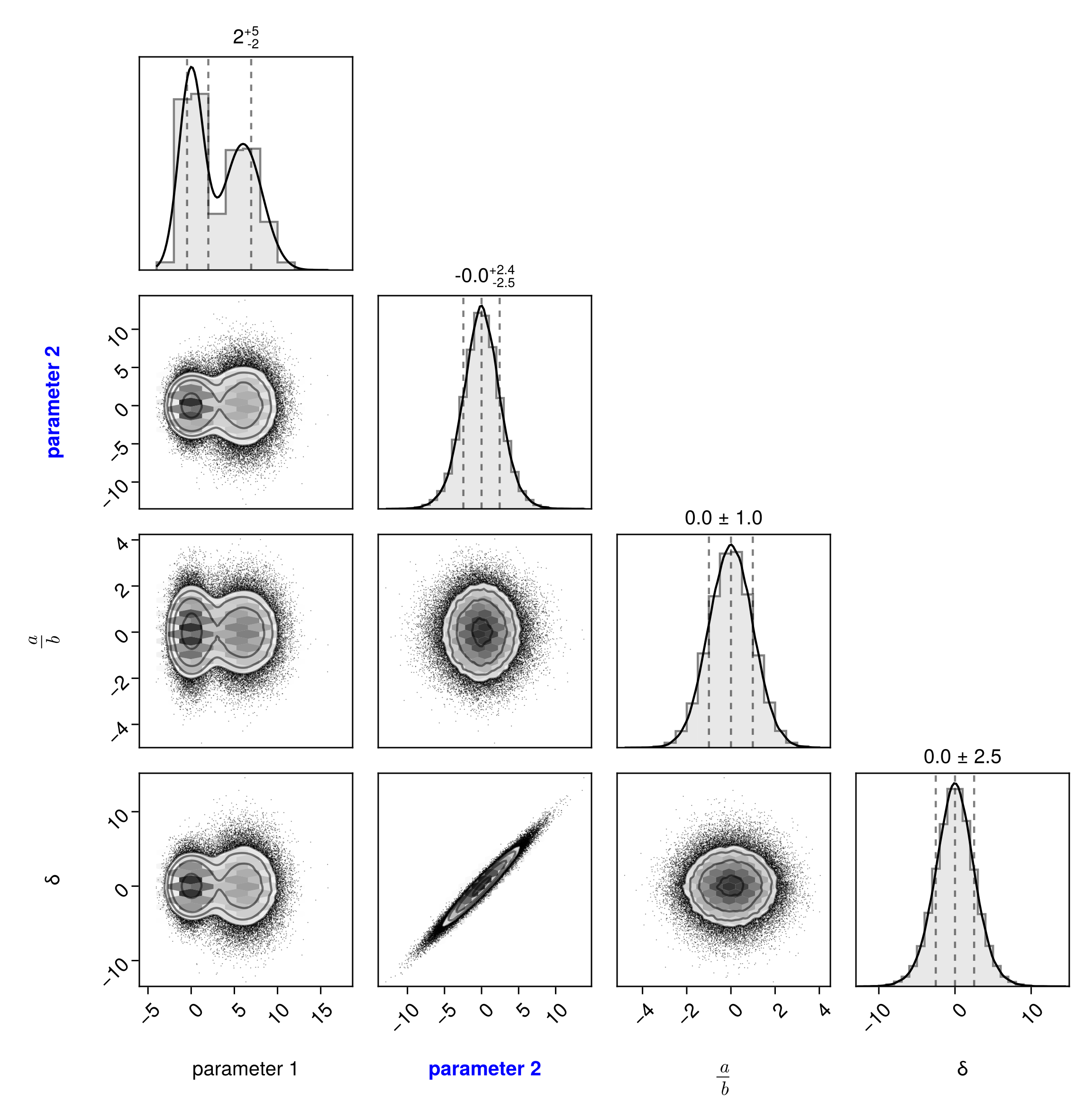
Override the axis labels:
pairplot(df, labels = Dict(
    # basic string
    :α => "parameter 1",
    # Makie rich text
    :β => rich("parameter 2", font=:bold, color=:blue),
    # LaTeX String
    :γ => L"\frac{a}{b}",
))
Let's move onto more complex examples. The full syntax of the pairplot function is:
pairplot(
    PairPlots.Series(data) => (::PairPlots.VizType...),
)
If you don't need to adjust any parameters for a whole series, you can just pass in a data source and PairPlots will wrap it for you:
pairplot(
    data => (::PairPlots.VizType...),
)
Let's see how this works by iteratively building up the default visualization.
First, create a basic histogram plot:
pairplot(
    df => (PairPlots.Hist(),) # note the comma
)
Note
A tuple or list of visualization types is required, even if you just want one. Make sure to include the comma in these examples.
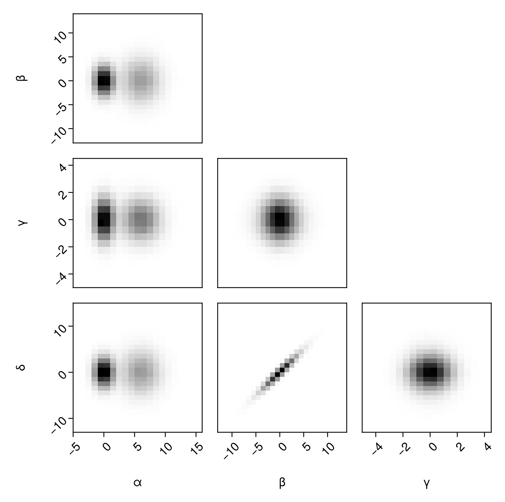
Or, a histogram with hexagonal binning:
pairplot(
    df => (PairPlots.HexBin(),)
)
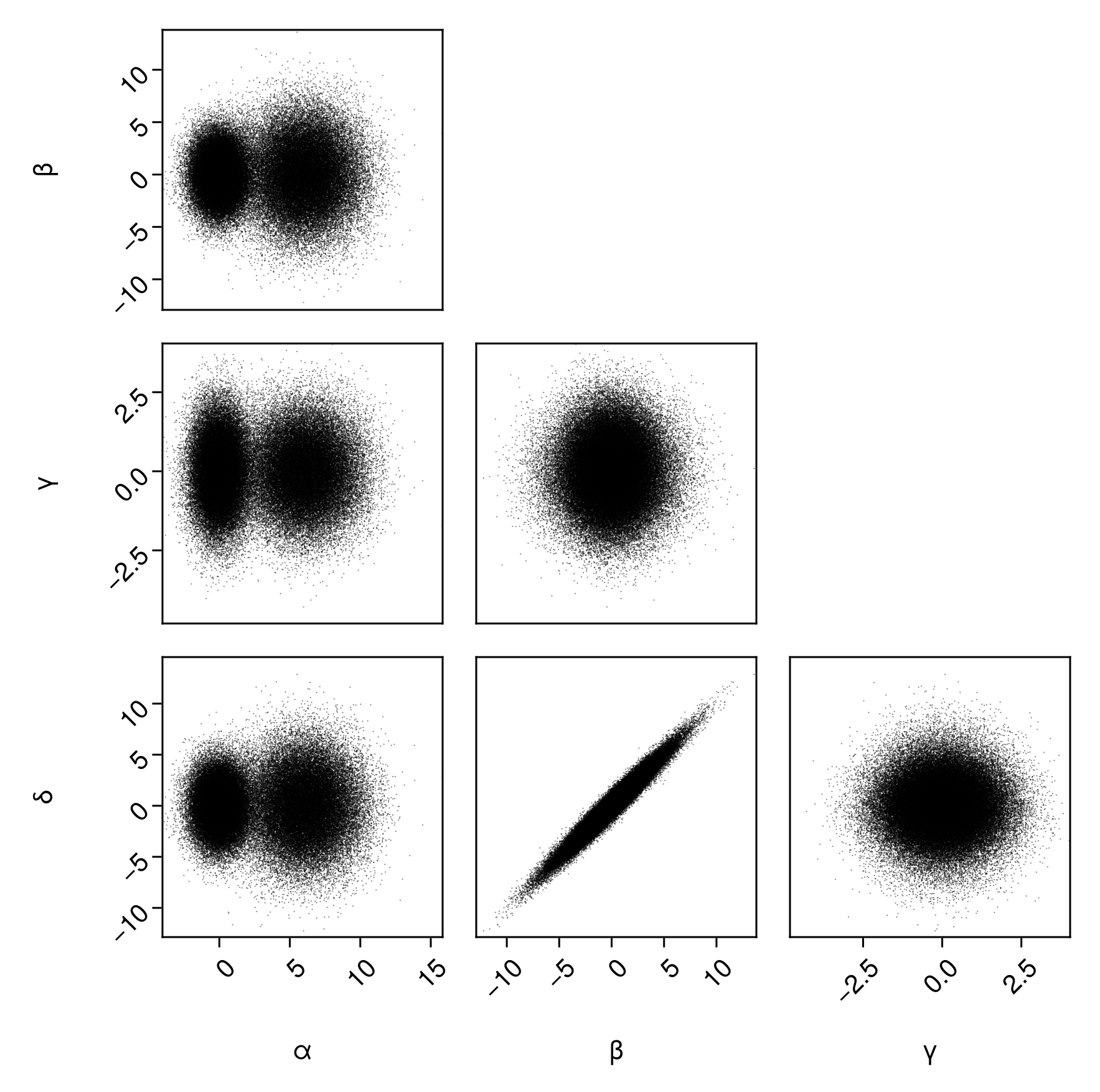
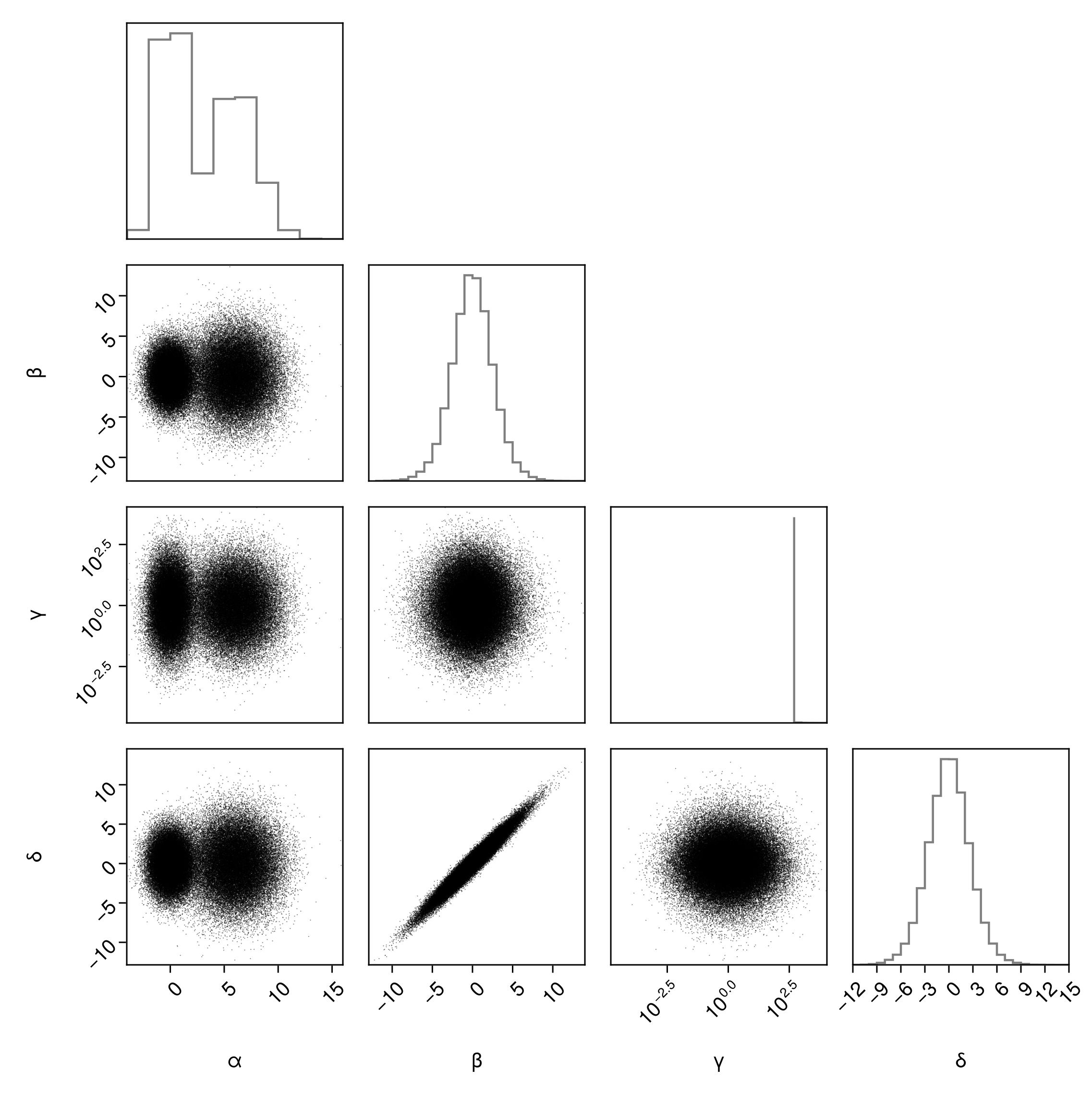
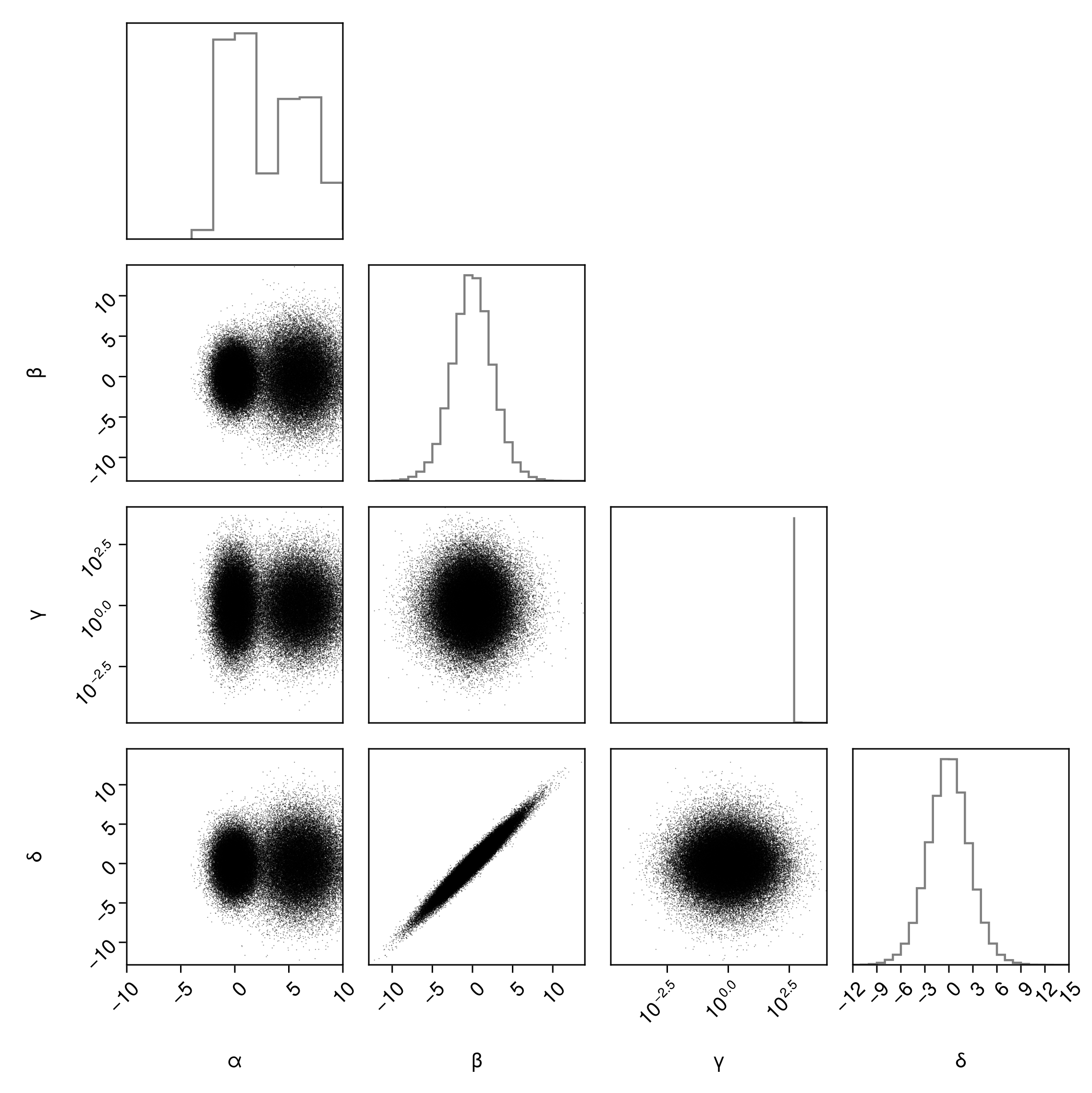
Scatter plots:
pairplot(
    df => (PairPlots.Scatter(),)
)
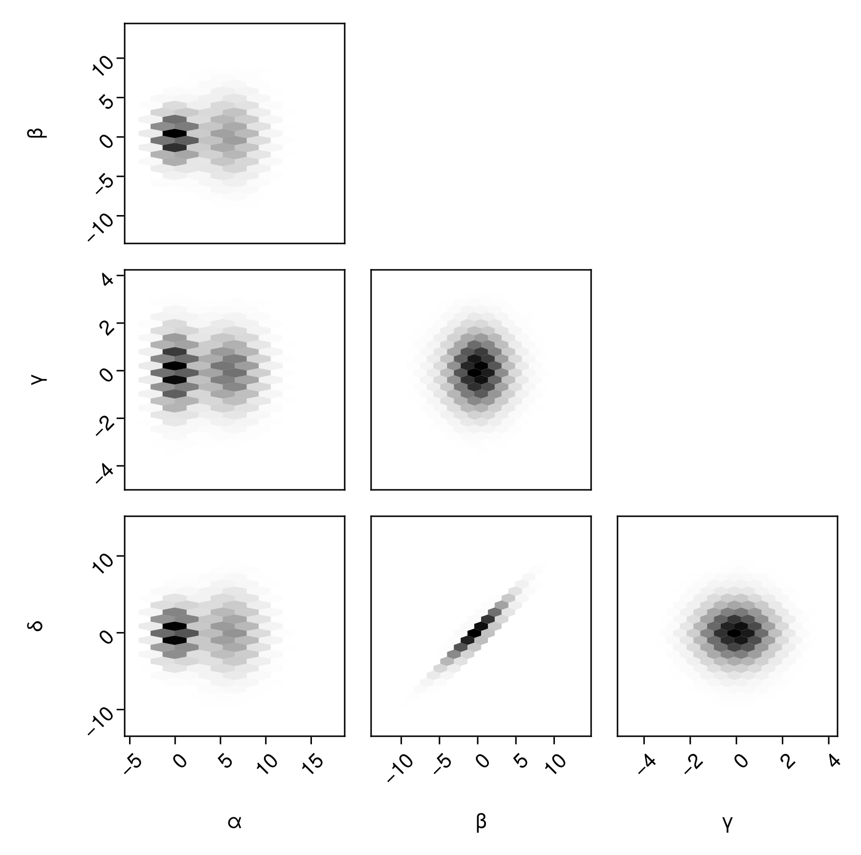
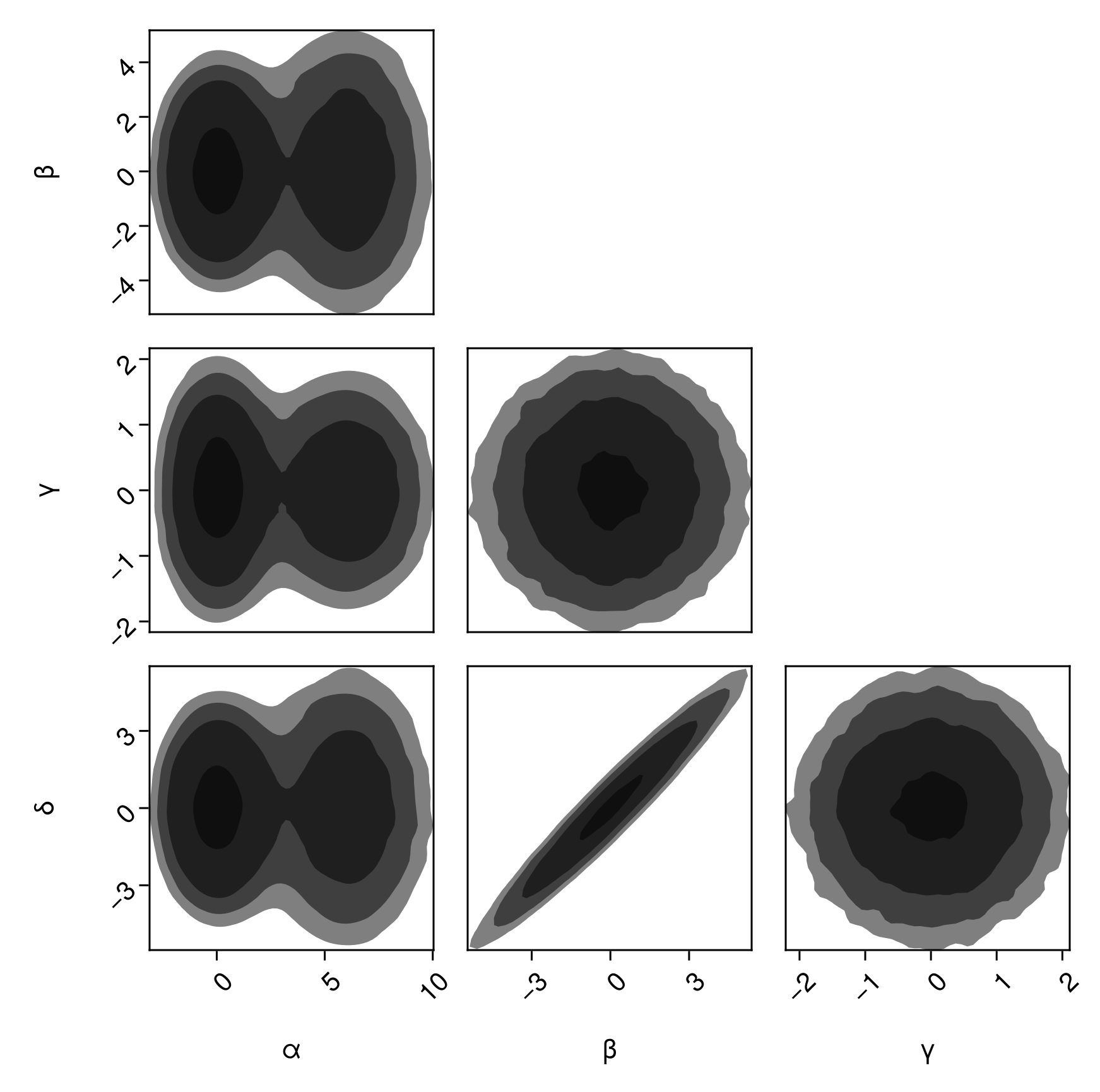
Filled contour plots:
pairplot(
    df => (PairPlots.Contourf(),)
)
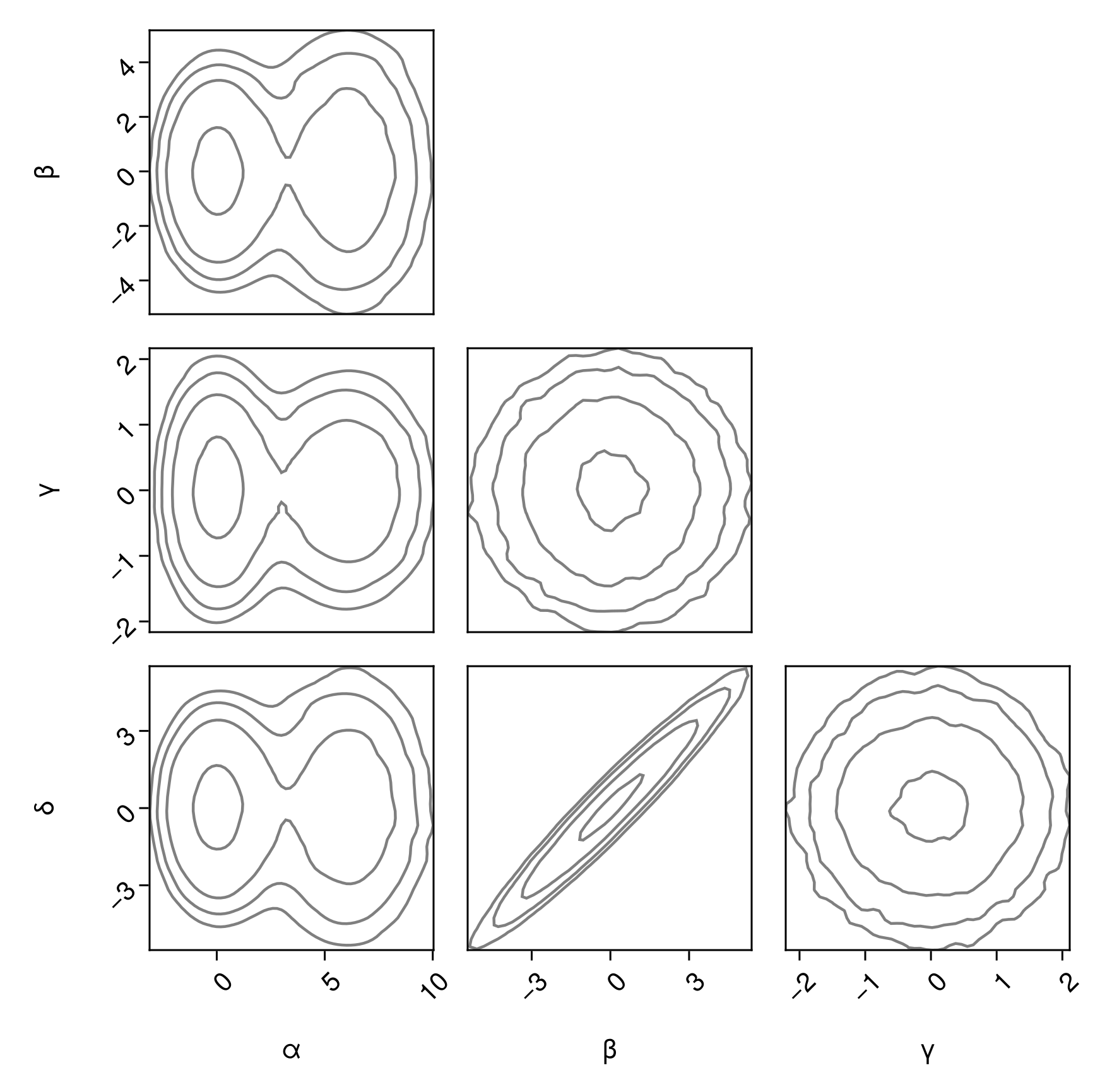
Outlined contour plots:
pairplot(
    df => (PairPlots.Contour(),)
)
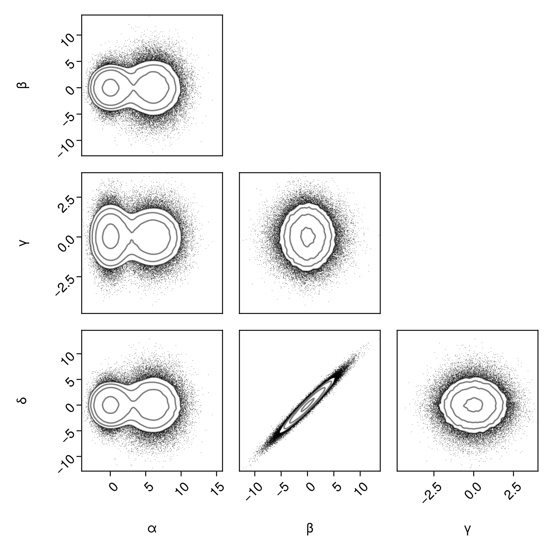
Now let's combine a few plot types. Scatter and contours:
pairplot(
    df => (PairPlots.Scatter(), PairPlots.Contour())
)
pairplot(
    df => (PairPlots.Scatter(), PairPlots.Contour())
)
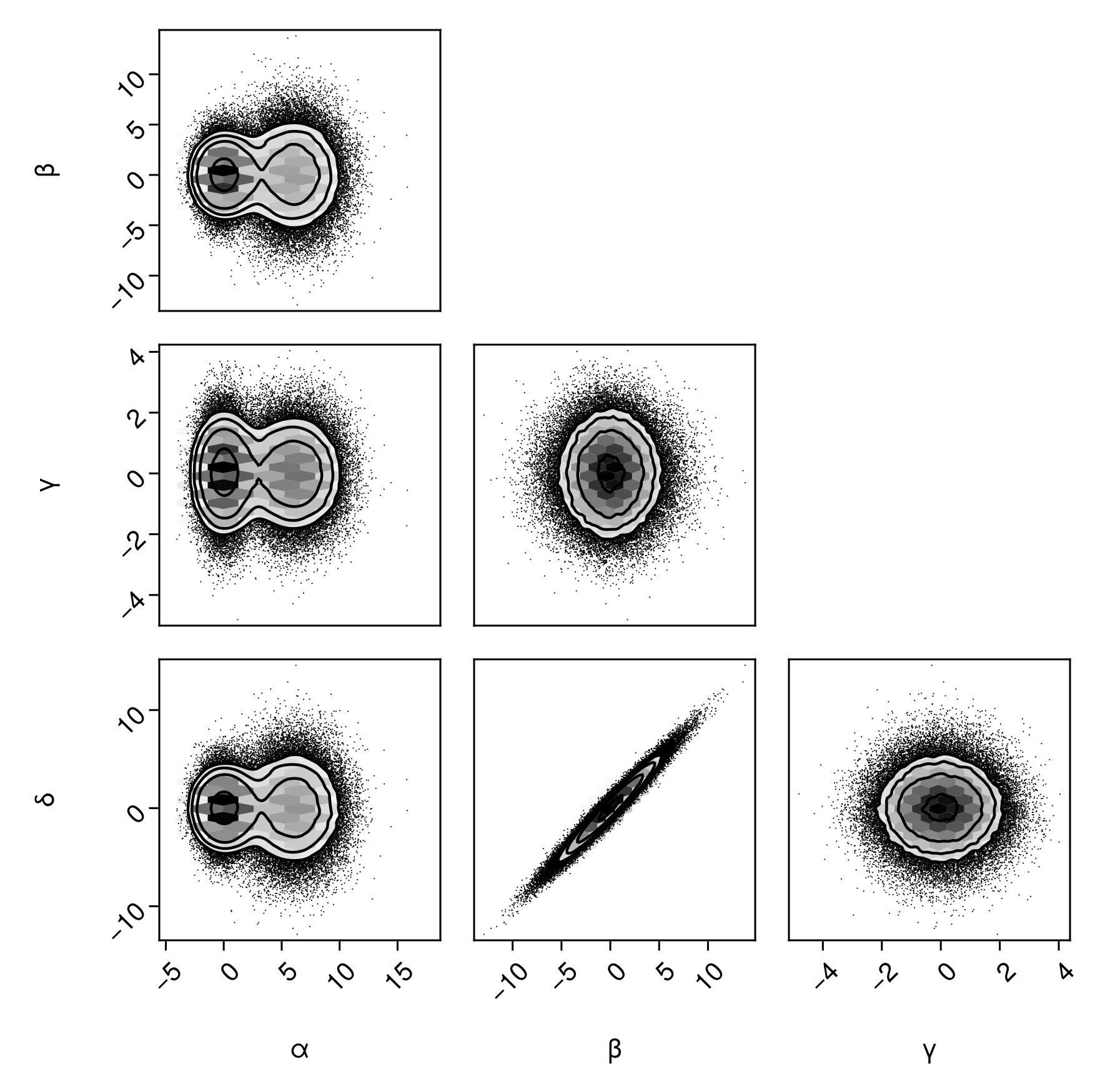
Scatter and contours, but hiding points above
pairplot(
    df => (PairPlots.Scatter(filtersigma=2), PairPlots.Contour())
)
Placing a HexBin series underneath:
pairplot(
    df => (
        PairPlots.HexBin(colormap=Makie.cgrad([:transparent, :black])),
        PairPlots.Scatter(filtersigma=2, color=:black),
        PairPlots.Contour(color=:black)
    )
)
Margin plots
We can add additional visualization layers to the diagonals of the plots using the same syntax.
pairplot(
    df => (
        PairPlots.HexBin(colormap=Makie.cgrad([:transparent, :black])),
        PairPlots.Scatter(filtersigma=2, color=:black),
        PairPlots.Contour(color=:black),
        # New:
        PairPlots.MarginDensity()
    )
)
Adjust margin density KDE bandwidth (note: this multiplies the default bandwidth. A value larger than 1 increases smoothing, less than 1 decreases smoothing).
pairplot(
    df => (
        PairPlots.HexBin(colormap=Makie.cgrad([:transparent, :black])),
        PairPlots.Scatter(filtersigma=2, color=:black),
        PairPlots.Contour(color=:black),
        # New:
        PairPlots.MarginDensity(bandwidth=0.1)
    )
)
Adding a histgoram instead of a smoothed kernel density estimate:
pairplot(
    df => (
        PairPlots.HexBin(colormap=Makie.cgrad([:transparent, :black])),
        PairPlots.Scatter(filtersigma=2, color=:black),
        PairPlots.Contour(color=:black),
        # New:
        PairPlots.MarginHist()
    )
)
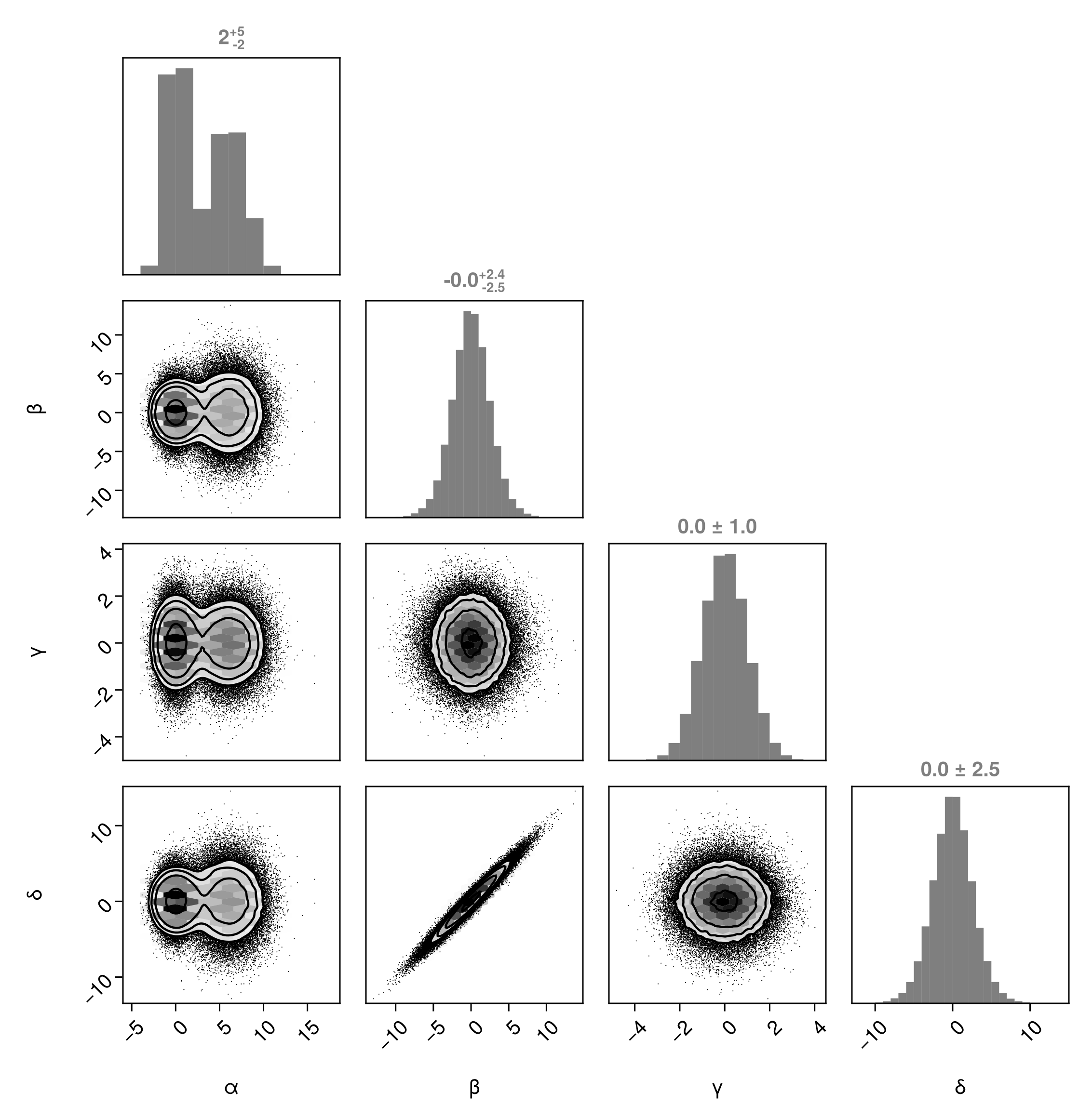
Add credible/confidence limit titles (see the documentation for MarginQuantileText and MarginQuantileLines to see how to change the quantiles):
pairplot(
    df => (
        PairPlots.HexBin(colormap=Makie.cgrad([:transparent, :black])),
        PairPlots.Scatter(filtersigma=2, color=:black),
        PairPlots.Contour(color=:black),
        PairPlots.MarginHist(),
        # New:
        PairPlots.MarginQuantileText(),
    )
)
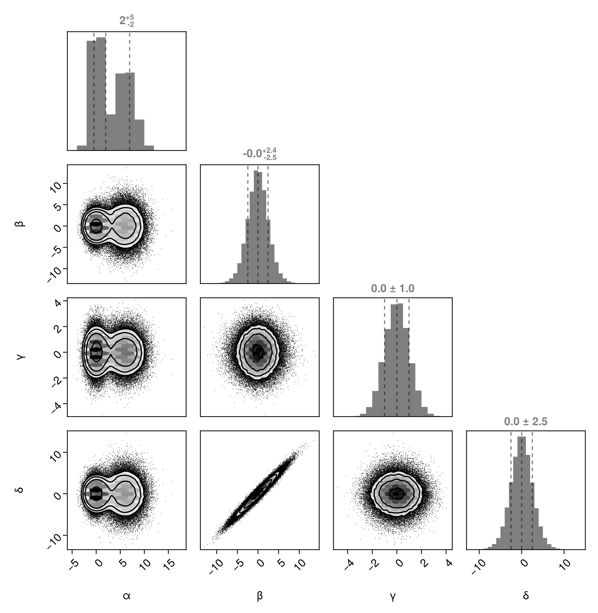
We can also include lines in the plot using MarginQuantileLines:
pairplot(
    df => (
        PairPlots.HexBin(colormap=Makie.cgrad([:transparent, :black])),
        PairPlots.Scatter(filtersigma=2, color=:black),
        PairPlots.Contour(color=:black),
        PairPlots.MarginHist(),
        PairPlots.MarginQuantileText(),
        # New:
        PairPlots.MarginQuantileLines(),
    )
)
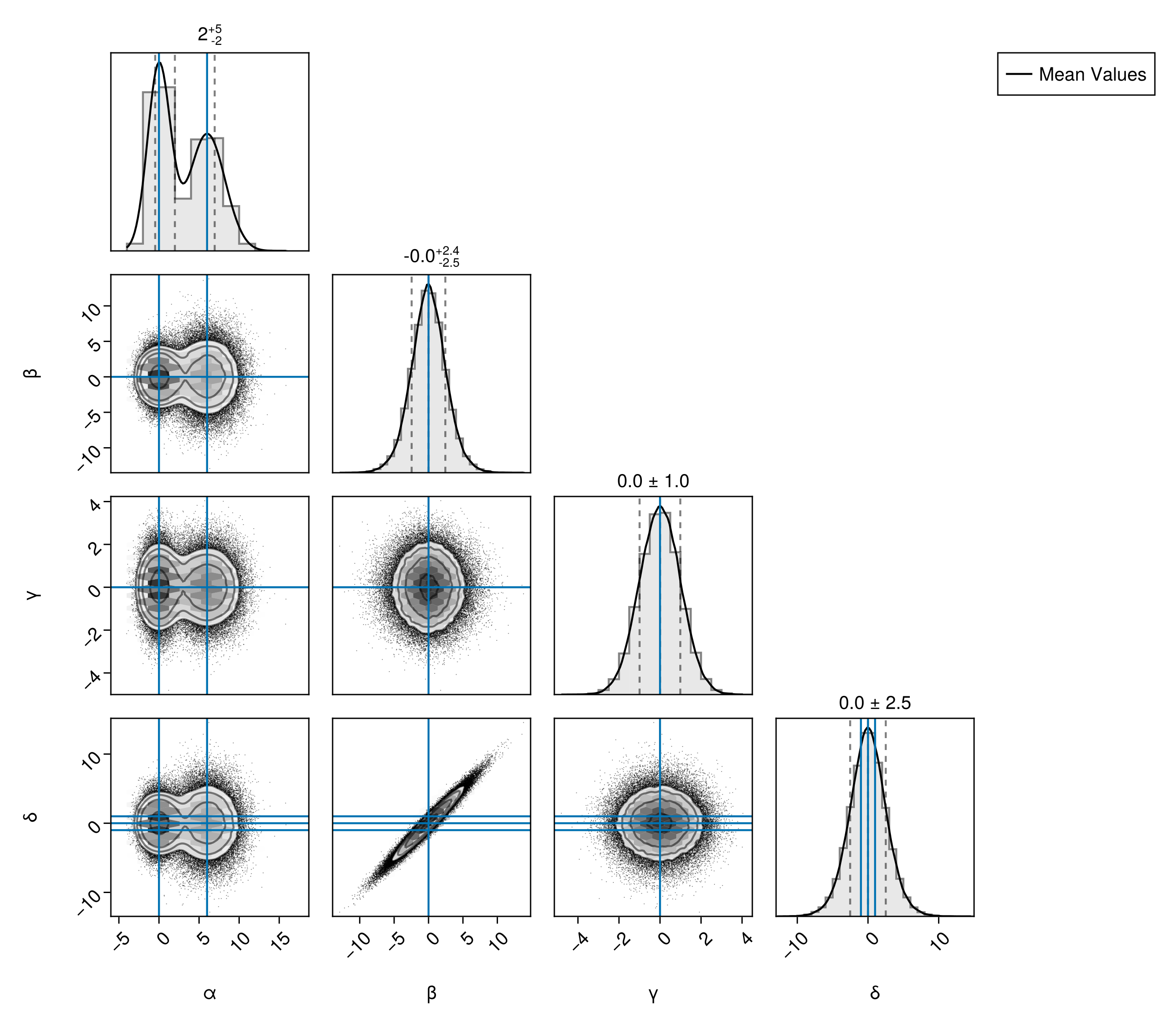
Truth Lines
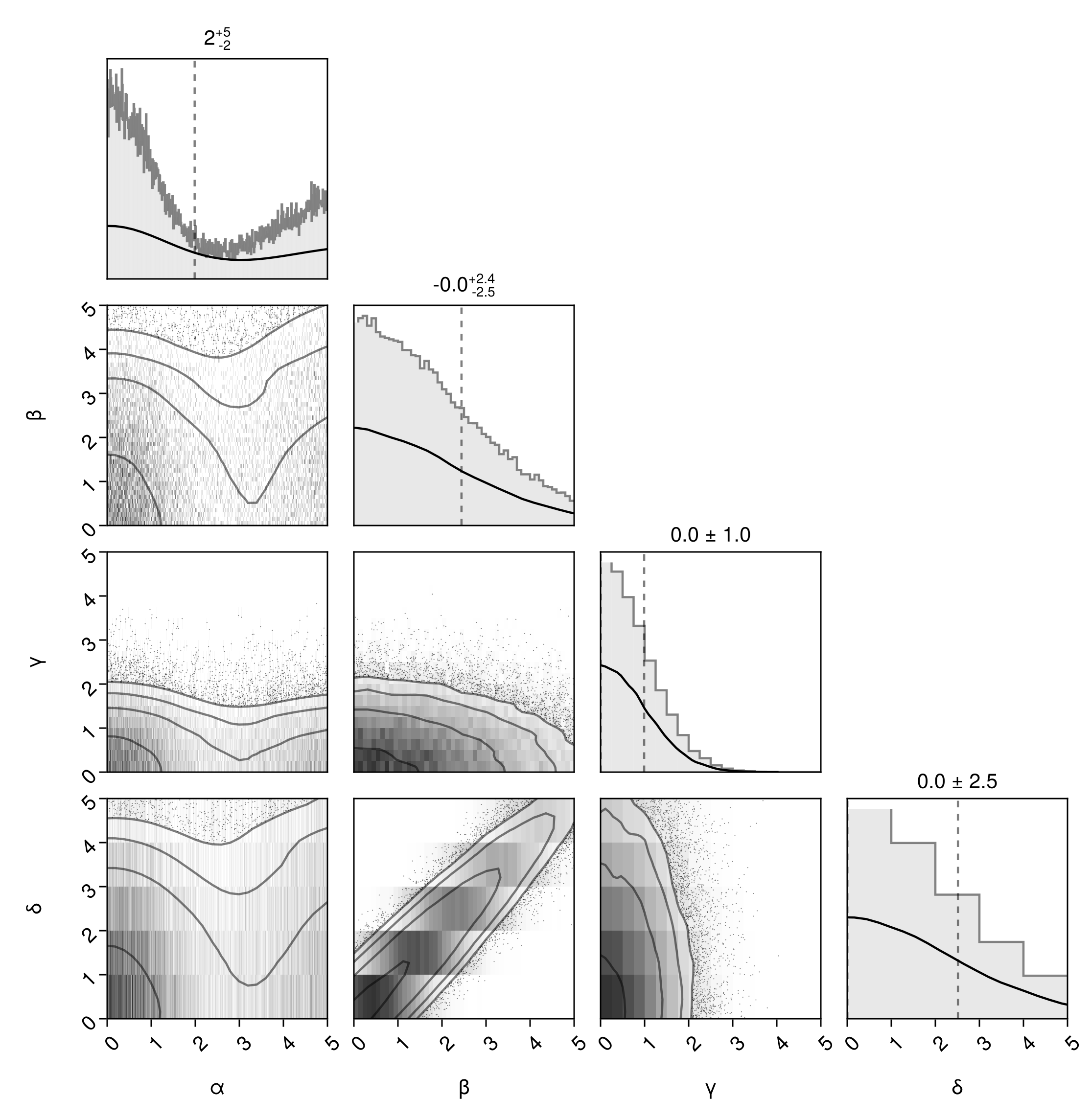
You can quickly add lines to mark particular values of each variable on all subplots using Truth:
pairplot(
    df,
    PairPlots.Truth(
        (;
            α = [0, 6],
            β = 0,
            γ = 0,
            δ = [-1, 0, +1],
        ),
        label="Mean Values"
    )
)
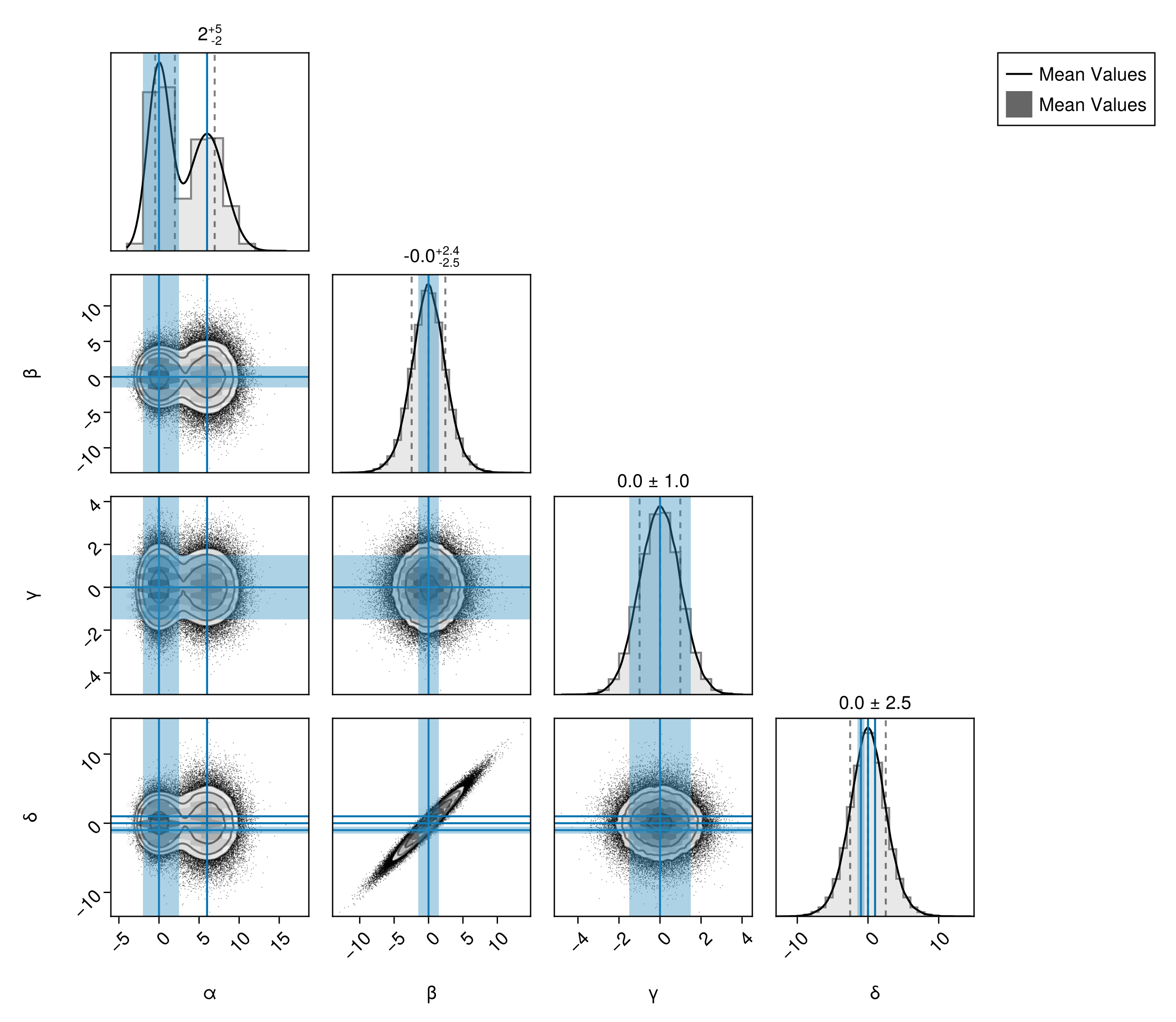
Truth Bands
You can also add bands to mark particular values of each variable on all subplots using Band:
pairplot(
    df,
    PairPlots.Truth(
        (;
            α = [0, 6],
            β = 0,
            γ = 0,
            δ = [-1, 0, +1],
        ),
    label="Mean Values"
    ),
    PairPlots.Band(
    (;
        α = [-2.0, 2.5],
        β = [-1.5, 1.5],
        γ = [-1.5, 1.5],
        δ = [-1.5, -0.5],
    ),
    label="Mean Values"
    )
)
Trend Lines
You can quickly add a linear trend line to each pair of variables by passing a trend-line series:
pairplot(
    df => (
        PairPlots.Scatter(),
        PairPlots.MarginHist(),
        PairPlots.TrendLine(color=:red), # default is red
    ),
    fullgrid=true
)
Correlation
You can add a calculated correlation value between every pair of variables by passing PairPlots.Correlation(). You can customize the number of digits and the position of the text.
pairplot(
    df => (
        PairPlots.Scatter(),
        PairPlots.MarginHist(),
        PairPlots.TrendLine(color=:red), # default is red
        PairPlots.PearsonCorrelation()
    ),
    fullgrid=true
)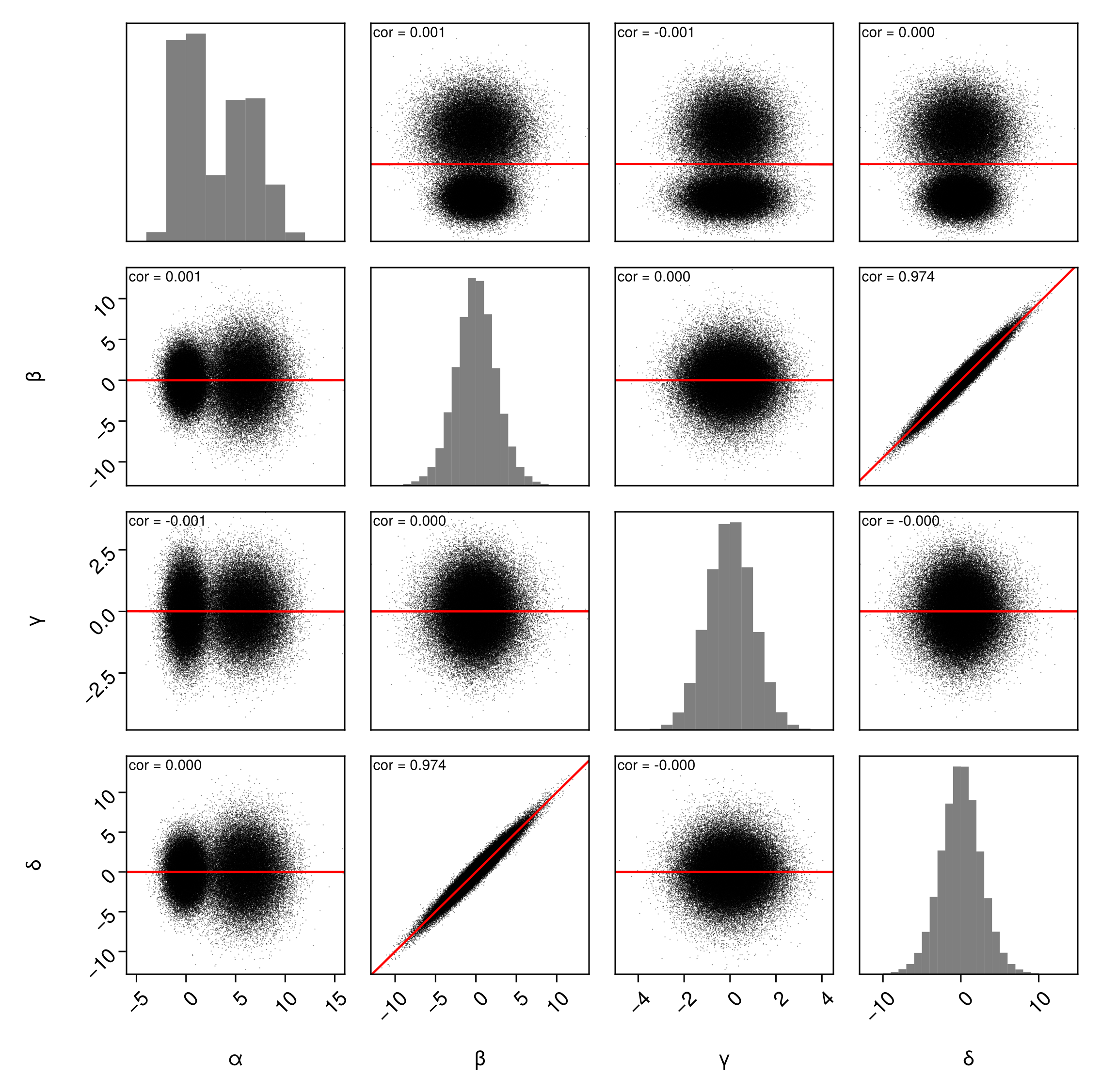
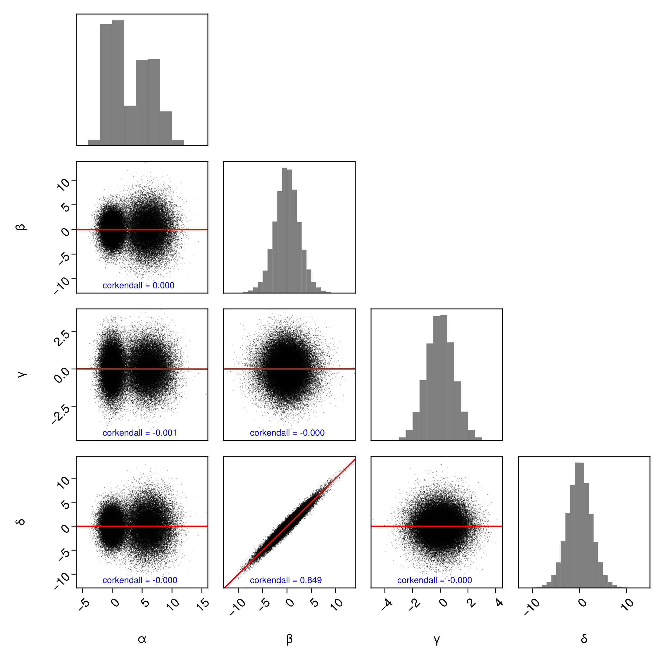
PairPlots.PearsonCorrelation() is an alias for PairPlots.Calculation(StatsBase.cor). Feel free to pass any function that accepts two AbstractVectors and calculates a number:
using StatsBase
pairplot(
    df => (
        PairPlots.Scatter(),
        PairPlots.MarginHist(),
        PairPlots.TrendLine(),
        PairPlots.Calculation(
            corkendall,
            color=:blue,
            position=Makie.Point2f(0.2, 0.1)
        )
    ),
)
Customize Axes
You can customize the axes of the subplots freely in two ways. For these examples, we'll create a variable that is log-normally distributed.
dfln = DataFrame(;α, β, γ=10 .^ γ, δ)First, you can pass axis parameters for all plots along the diagonal using the diagaxis keyword or all plots below the diagonal using the bodyaxis parameter.
Turn on grid lines for the body axes:
pairplot(dfln, bodyaxis=(;xgridvisible=true, ygridvisible=true))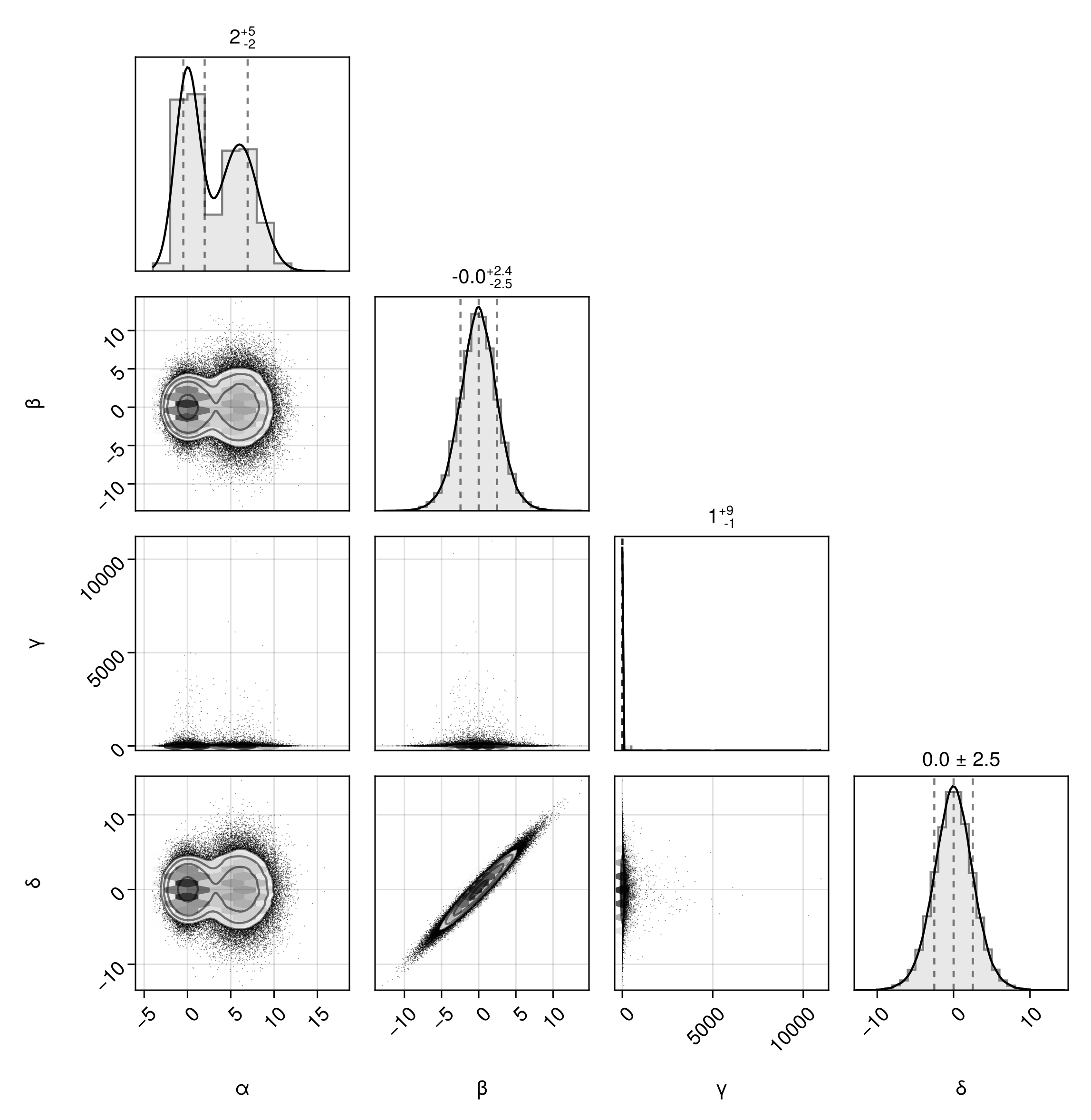
Apply a pseduo-log scale on the margin plots along the diagonal:
pairplot(dfln, diagaxis=(;yscale=Makie.pseudolog10, ygridvisible=true))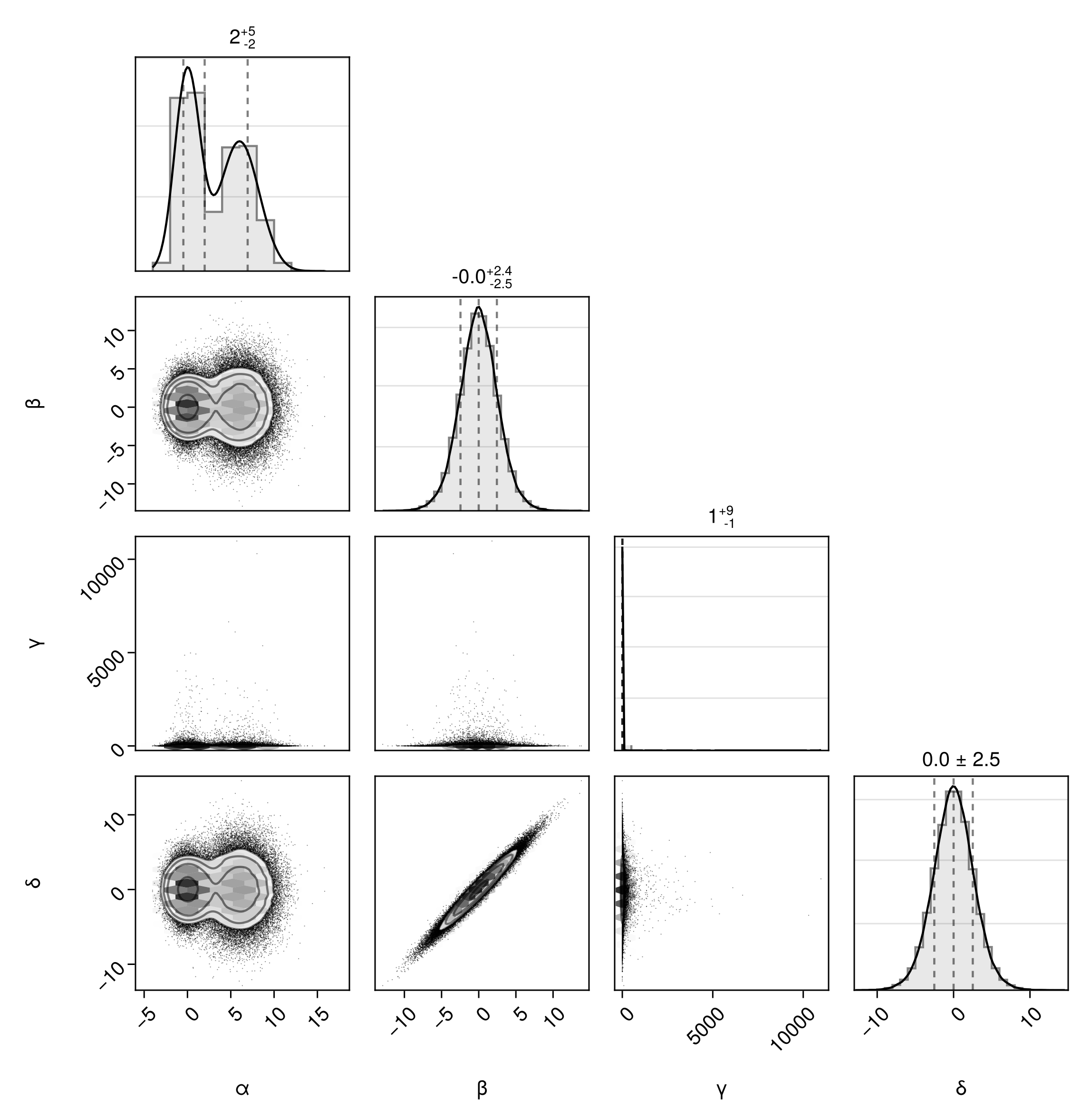
The second way you can control the axes is by table column. This allows you to customize how an individual variable is presented across the pair plot.
For example, we can apply a log scale to all axes that the γ variable is plotted against:
pairplot(
    dfln => (PairPlots.Scatter(), PairPlots.MarginStepHist()),
    axis=(;
        γ=(;
            scale=log10
        )
    )
)
Note
Do not prefix the attribute with x or y. PairPlots.jl will add the correct prefix as needed.
Warning
Log scale variables usually work best with Scatter series. Histogram and contour based series sometimes extend past zero, breaking the scale.
There is also special support for setting the axis limits of each variable. The following applies the correct limits either to the vertical axis or horizontal axis as appropriate. Note that the parameters low and/or high must be passed as a named tuple.
pairplot(
    dfln => (PairPlots.Scatter(), PairPlots.MarginStepHist()),
    axis=(;
        α=(;
            lims=(;low=-10, high=+10)
        ),
        γ=(;
            scale=log10
        )
    )
)
Adding a title
fig = pairplot(df)
Label(fig[0,:], "This is the title!")
fig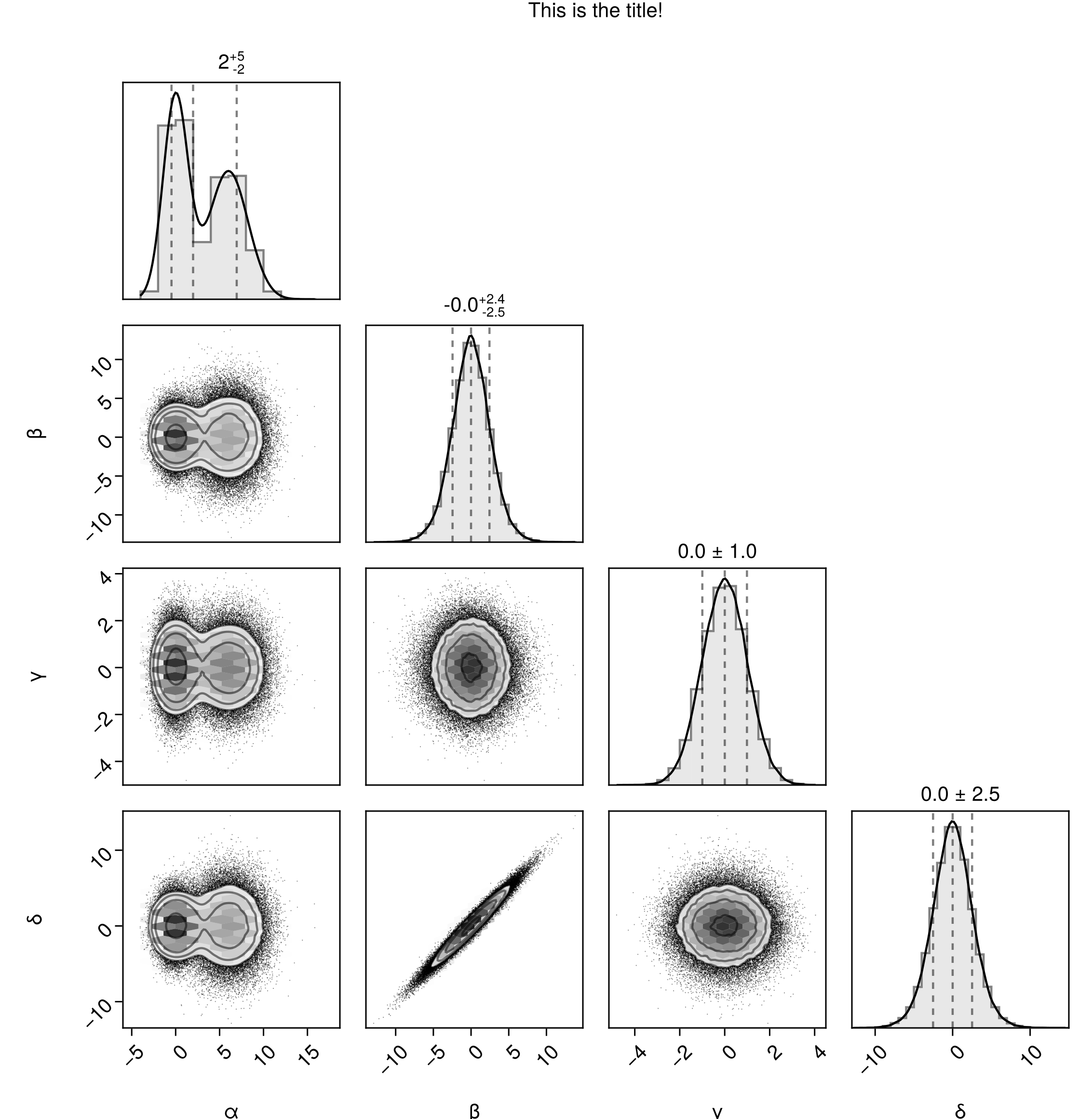
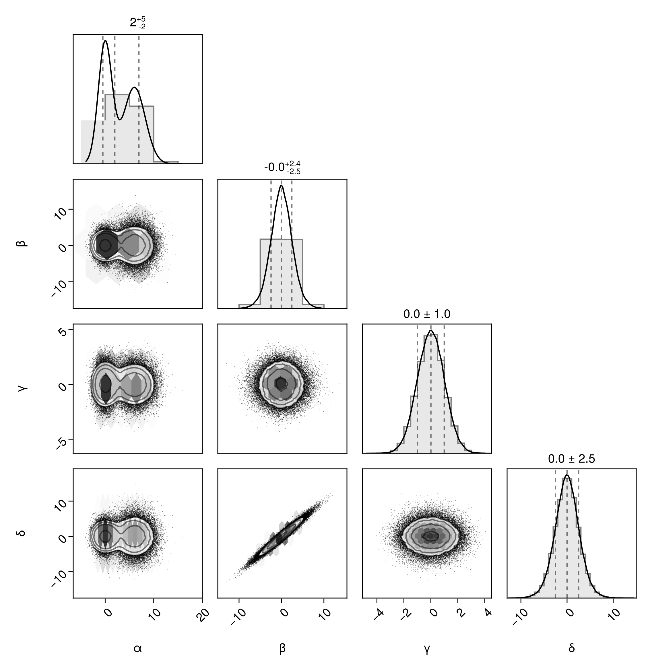
Customize bins
There are a few different ways you can customize the bin sizing.
First, you can customize the number of bins by passing the argument bins=n to relevant series, eg Hist(bins=10).
Second, you can specify the number of bins by series by passing a dictionary of bin sizes:
pairplot(df, bins=Dict(
    :α => 5,
    :β => 10,
    :γ => 20,
    :δ => 40,
))
Third, you can specify the exact bin ranges for all series. Note! If you go this route, you must provide the bin ranges (not counts) for all series, not just some series. You can't mix and match.
pairplot(df, bins=Dict(
    :α => -5:0.01:15,
    :β => -10:0.02:15,
    :γ => -5:0.1:5,
    :δ => -10:1:10,
))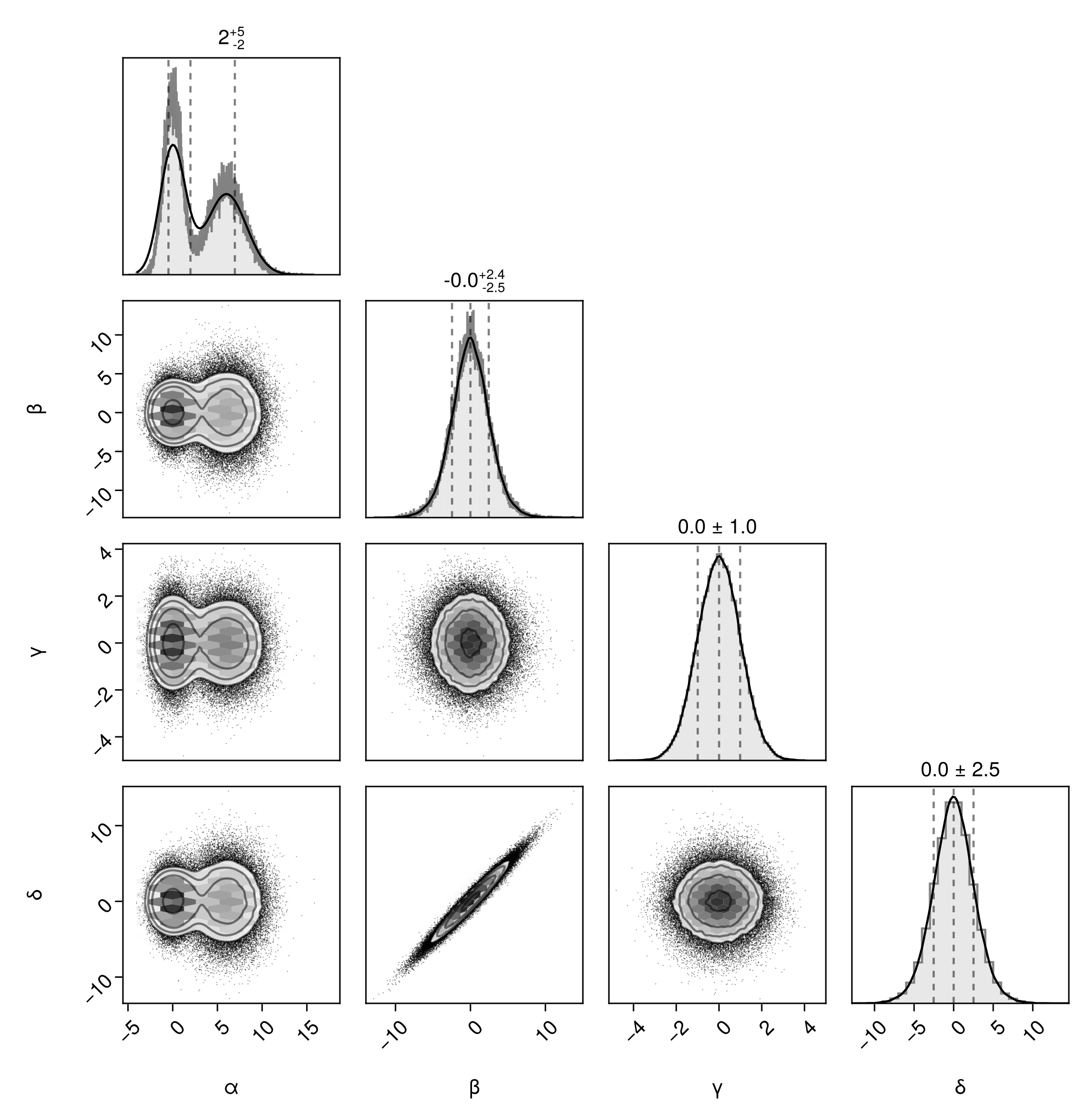
The bin ranges don't directly control the axis limits. To control those, use the axis argument:
pairplot(df, bins=Dict(
        :α => -5:0.01:15,
        :β => -10:0.02:15,
        :γ => -5:0.1:5,
        :δ => -10:1:10,
    ),
    axis = Dict(
        :α => (;lims=(low=0, high=5)),
        :β => (;lims=(low=0, high=5)),
        :γ => (;lims=(low=0, high=5)),
        :δ => (;lims=(low=0, high=5)),
    )
)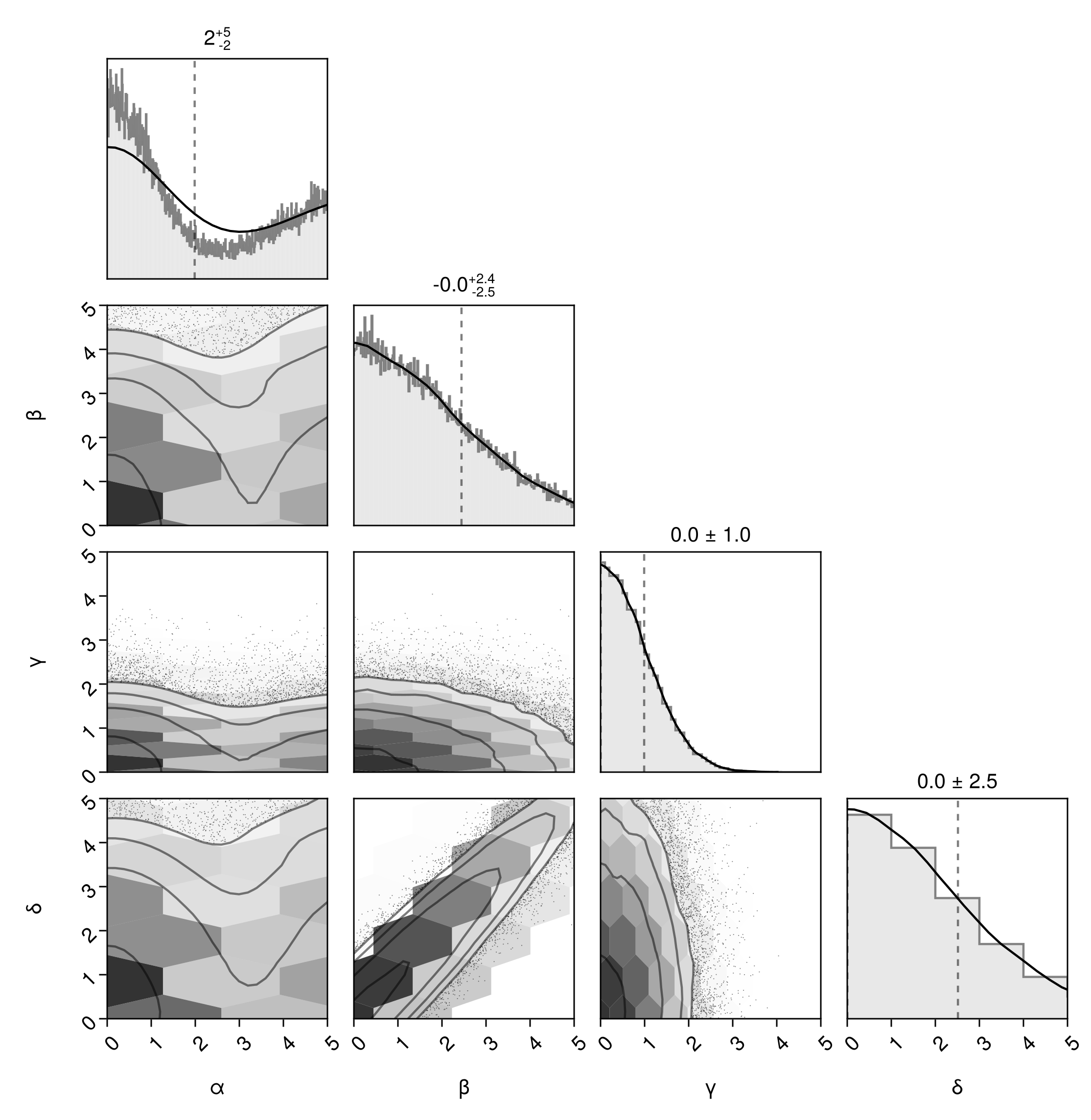
Be aware that the HexBin layer doesn't obey specific bin ranges. If you want the body 2D histograms to match, then you should replace HexBin with Hist:
pairplot(
    df=>(
        PairPlots.Hist(colormap=Makie.cgrad([:transparent, "#333"])),
        PairPlots.Scatter(filtersigma=2),
        PairPlots.Contour(linewidth=1.5),
        PairPlots.MarginHist(color=Makie.RGBA(0.4,0.4,0.4,0.15)),
        PairPlots.MarginStepHist(color=Makie.RGBA(0.4,0.4,0.4,0.8)),
        PairPlots.MarginDensity(
            color=:black,
            linewidth=1.5f0
        ),
        PairPlots.MarginQuantileText(color=:black,font=:regular),
        PairPlots.MarginQuantileLines(),
    ),
    bins=Dict(
        :α => 0:0.01:5,
        :β => 0:0.1:5,
        :γ => 0:0.25:5,
        :δ => 0:1:5,
    ),
    axis = Dict(
        :α => (;lims=(low=0, high=5)),
        :β => (;lims=(low=0, high=5)),
        :γ => (;lims=(low=0, high=5)),
        :δ => (;lims=(low=0, high=5)),
    )
)
You can either pass the bins dict for an entire pair plot, or for particular series by using it as an argument to Series.
Layouts
The pairplot function integrates easily within larger Makie Figures.
Note
This functionality is not directly exposed to Python, but is available through the pairplots.Makie submodule.
Customizing the figure:
fig = Figure(size=(400,400))
pairplot(fig[1,1], df => (PairPlots.Contourf(),))
fig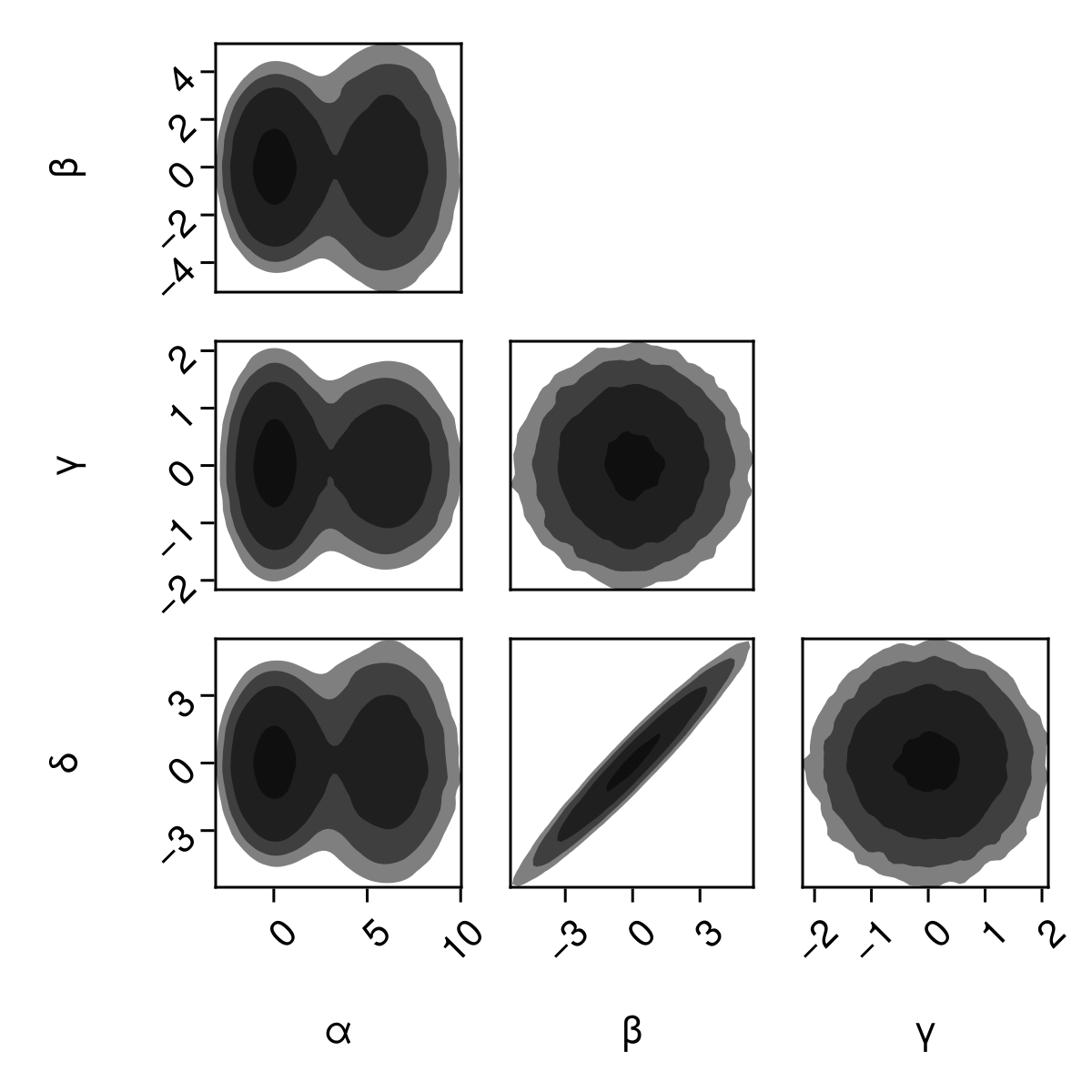
Note
If you only need to pass arguments to Figure, for convenience you can use pairplot(df, figure=(;...)).
You can plot into one part of a larger figure:
fig = Figure(size=(800,800))

scatterlines(fig[1,1], randn(40))

pairplot(fig[1,2], df)

lines(fig[2,:], randn(200))


colsize!(fig.layout, 2, 450)
rowsize!(fig.layout, 1, 450)

fig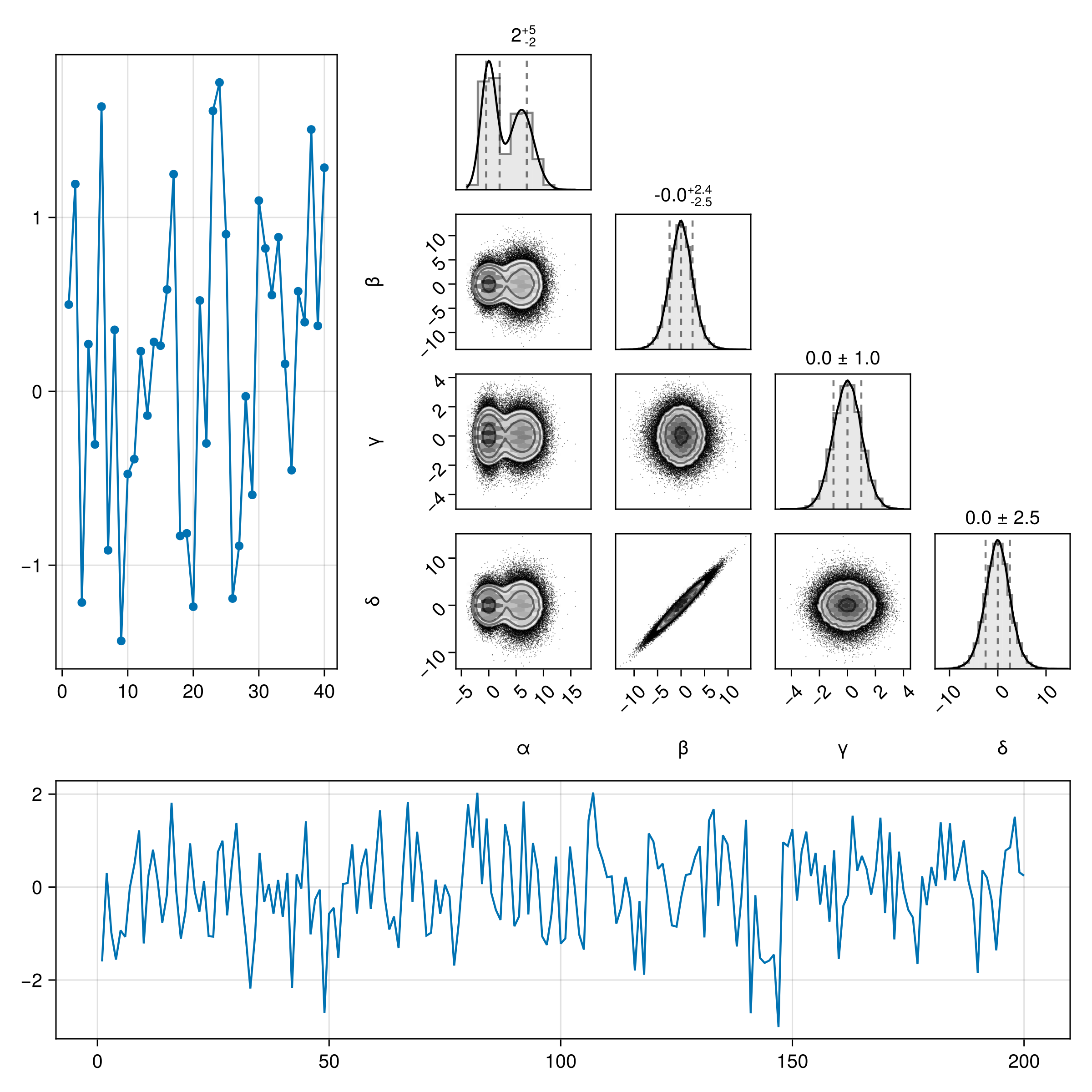
Adjust the spacing between axes inside a pair plot:
fig = Figure(size=(600,600))

# Pair Plots must go into a Makie GridLayout. If you pass a GridPosition instead,
# PairPlots will create one for you.
# We can then adjust the spacing within that GridLayout.

gs = GridLayout(fig[1,1])
pairplot(gs, df)

rowgap!(gs, 0)
colgap!(gs, 0)

fig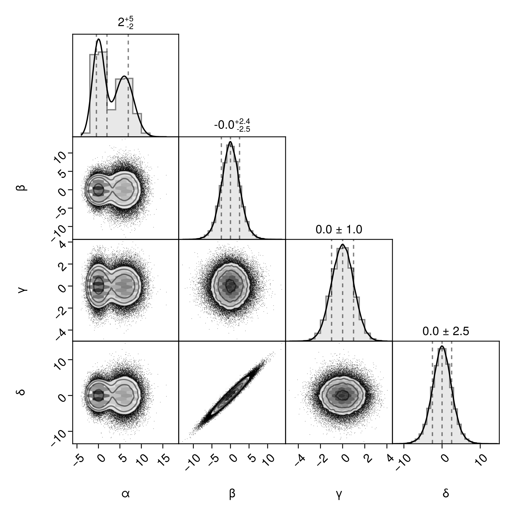
Multiple Series
You can plot multiple series by simply passing more than one table to pairplot They don't have to have all the same column names.
# The simplest table format is just a named tuple of vectors.
# You can also pass a DataFrame, or any other Tables.jl compatible object.
table1 = (;
x = randn(10000),
y = randn(10000),
)
table2 = (;
x = 1 .+ randn(10000),
y = 2 .+ randn(10000),
z = randn(10000),
)
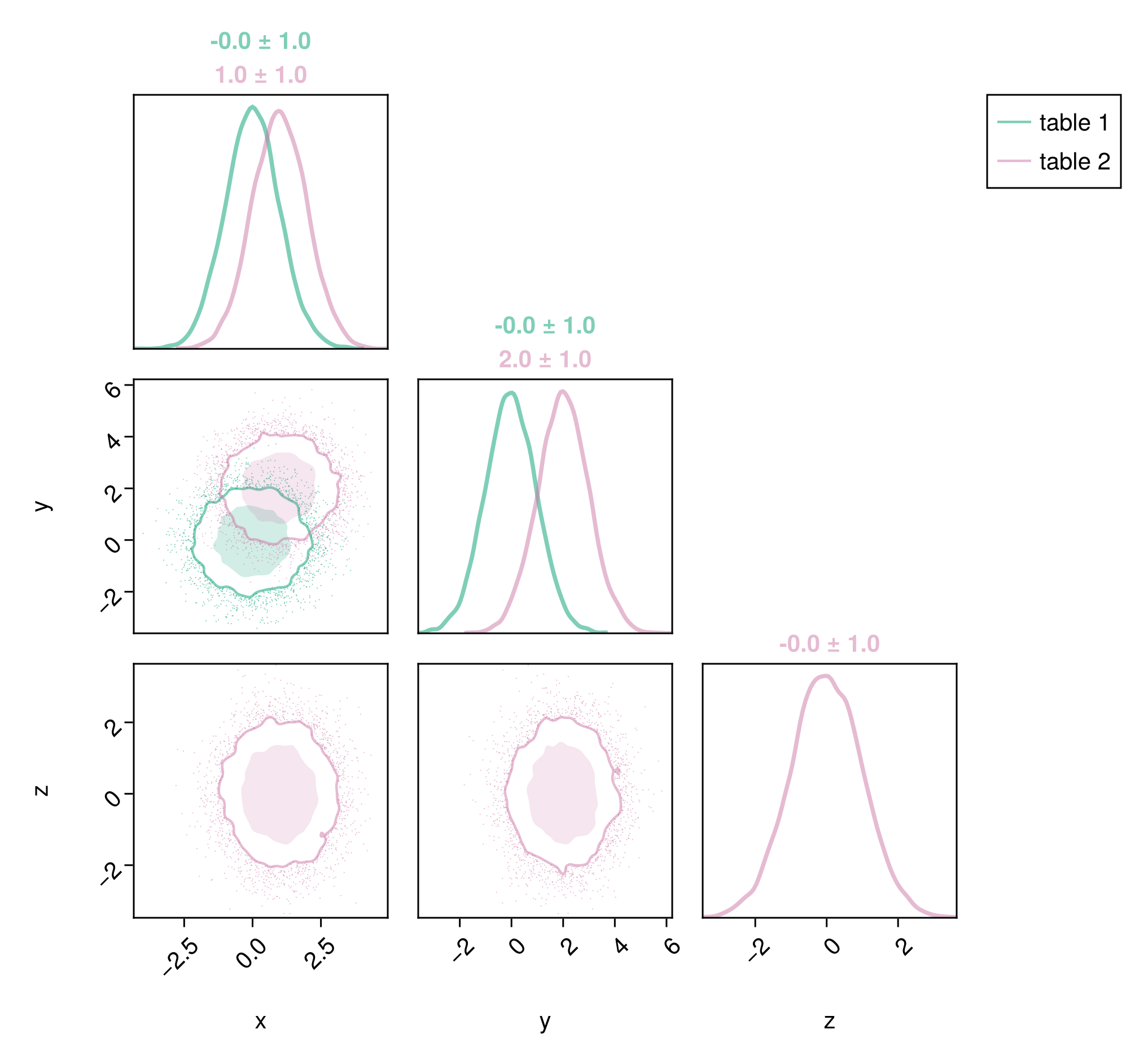
pairplot(table1, table2)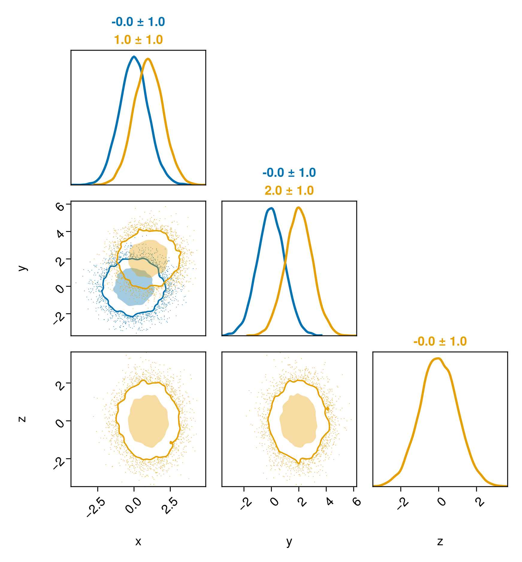
You may want to add a legend:
c1 = Makie.wong_colors(0.5)[3]
c2 = Makie.wong_colors(0.5)[4]
pairplot(
    PairPlots.Series(table1, label="table 1", color=c1, strokecolor=c1),
    PairPlots.Series(table2, label="table 2", color=c2, strokecolor=c2),
)
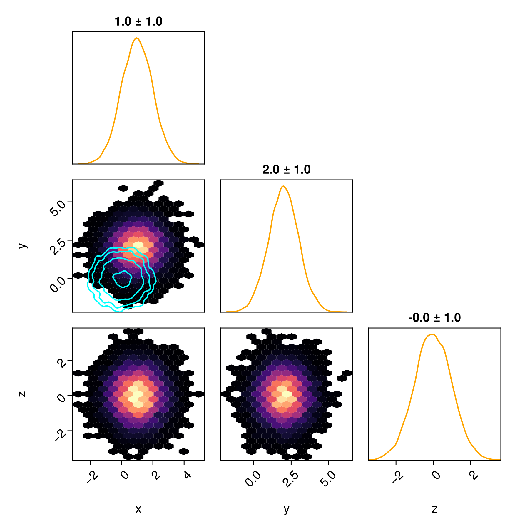
You can customize each series independently if you wish.
pairplot(
    table2 => (PairPlots.HexBin(colormap=:magma), PairPlots.MarginDensity(color=:orange),  PairPlots.MarginQuantileText(color=:black)),
    table1 => (PairPlots.Contour(color=:cyan, strokewidth=5),),
)
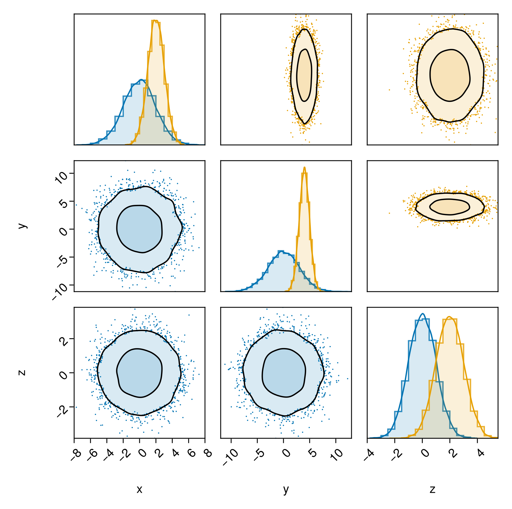
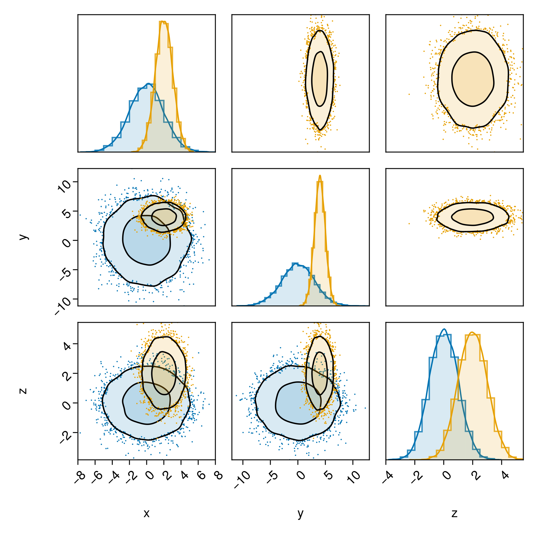
Comparing series across the diagonal
If you want to place one series on the left side of the plot and another series on the right side of the plot, you can specify bottomleft and topright separately for each series:
table1 = (;
    x = 2randn(10000),
    y = 3randn(10000),
    z = randn(10000),
)

table2 = (;
    x = 2 .+ randn(10000),
    y = 4 .+ randn(10000),
    z = 2 .- randn(10000),
)

c1 = Makie.wong_colors()[1]
layers_series_1 = (
    PairPlots.Scatter(filtersigma=3, color=c1, markersize=2),
    PairPlots.Contourf(strokewidth=1.5,color=(c1,0.15), bandwidth=2, sigmas=[1,3]),
    PairPlots.MarginHist(color=(c1, 0.15)),
    PairPlots.MarginStepHist(color=(c1, 0.8)),
    PairPlots.MarginDensity(
        color=c1,
        linewidth=1.5f0
    ),
)

c2 = Makie.wong_colors()[2]
layers_series_2 = (
    PairPlots.Scatter(filtersigma=3, color=c2, markersize=2),
    PairPlots.Contourf(strokewidth=1.5,color=(c2,0.15), bandwidth=2, sigmas=[1,3]),
    PairPlots.MarginHist(color=(c2,0.15)),
    PairPlots.MarginStepHist(color=(c2,0.8)),
    PairPlots.MarginDensity(
        color=c2,
        linewidth=1.5f0
    ),
)

pairplot(
    PairPlots.Series(table1, bottomleft=true, topright=false) => layers_series_1,
    PairPlots.Series(table2, bottomleft=false, topright=true) => layers_series_2,
)
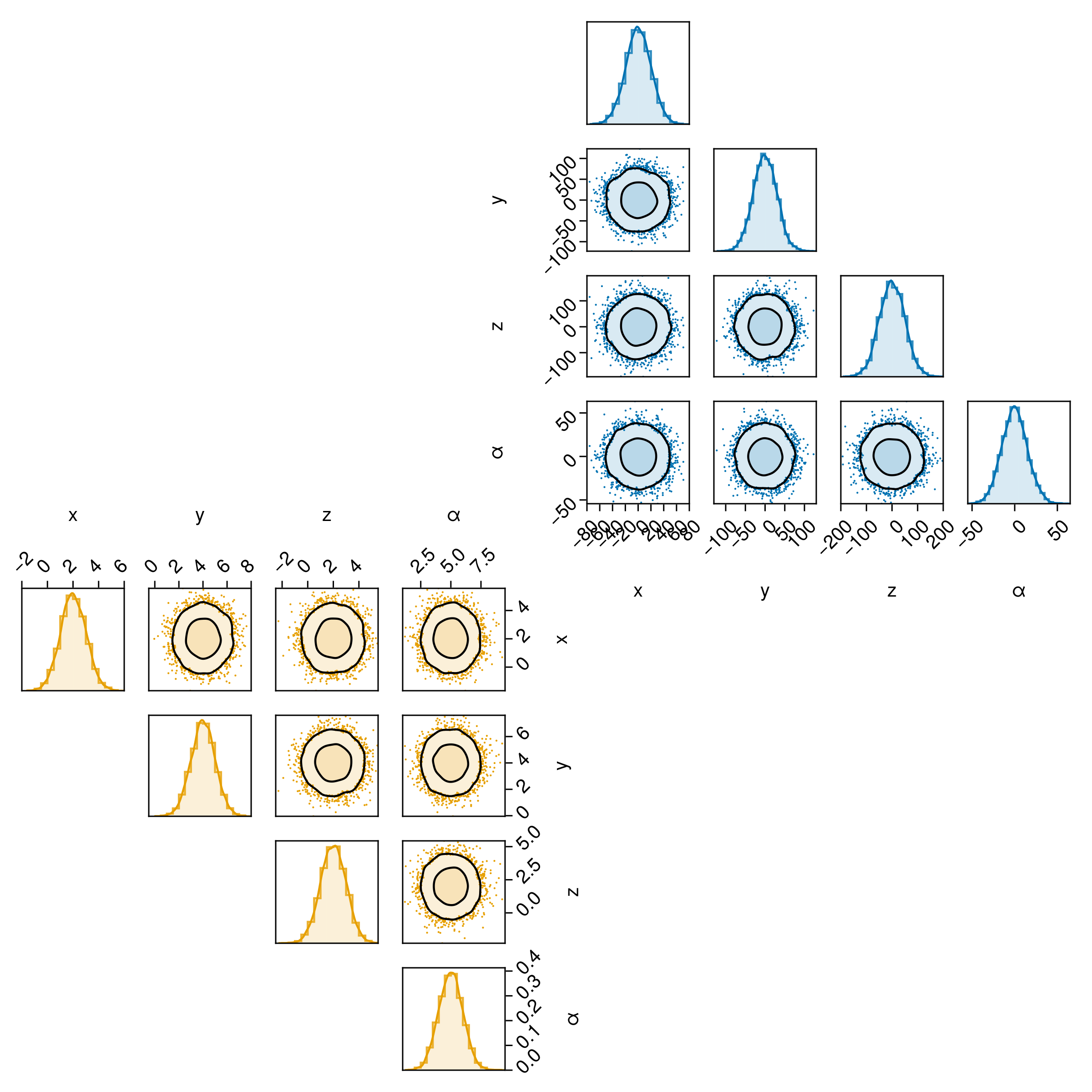
Another alternative would be to put one on both sides, and the other only on one side:
pairplot(
    PairPlots.Series(table1, bottomleft=true, topright=false) => layers_series_1,
    PairPlots.Series(table2, bottomleft=true, topright=true) => layers_series_2,
)
Merging two separate pair plots
If you want to combine two distinct pair plots, you can do so by plotting into your own figure object, and setting bottomleft and topright appropriately.
For example, this might be useful if you want to compare two series with very different variances.
table1 = (;
    x = 20randn(10000),
    y = 30randn(10000),
    z = 50randn(10000),
    α = 15randn(10000),
)

table2 = (;
    x = 2 .+ randn(10000),
    y = 4 .+ randn(10000),
    z = 2 .- randn(10000),
    α = 5 .- randn(10000),
)


fig = Figure(
    # You will need to adjust this yourself to make all the text etc.
    # the right size
    size=(800,800)
)


c1 = Makie.wong_colors()[1]
layers_series_1 = (
    PairPlots.Scatter(filtersigma=3, color=c1, markersize=2),
    PairPlots.Contourf(strokewidth=1.5,color=(c1,0.15), bandwidth=2, sigmas=[1,3]),
    PairPlots.MarginHist(color=(c1, 0.15)),
    PairPlots.MarginStepHist(color=(c1, 0.8)),
    PairPlots.MarginDensity(
        color=c1,
        linewidth=1.5f0
    ),
)

c2 = Makie.wong_colors()[2]
layers_series_2 = (
    PairPlots.Scatter(filtersigma=3, color=c2, markersize=2),
    PairPlots.Contourf(strokewidth=1.5,color=(c2,0.15), bandwidth=2, sigmas=[1,3]),
    PairPlots.MarginHist(color=(c2,0.15)),
    PairPlots.MarginStepHist(color=(c2,0.8)),
    PairPlots.MarginDensity(
        color=c2,
        linewidth=1.5f0
    ),
)


# You can either:
# (A) plot into any layout range of your figure directly by passing `fig[?,?]` to pairplot() for free layout
# or (B) plot into a shared GridLayout to get nice alignment between the halves:
gs = GridLayout(fig[1,1])

pairplot(
    gs[2:5,1:4],
    table1 => layers_series_1,
    # table2 => layers_series_2,
    bottomleft=true, topright=false
)

pairplot(
    gs[1:4,2:5],
    table2 => layers_series_2,
    bottomleft=false, topright=true
)
fig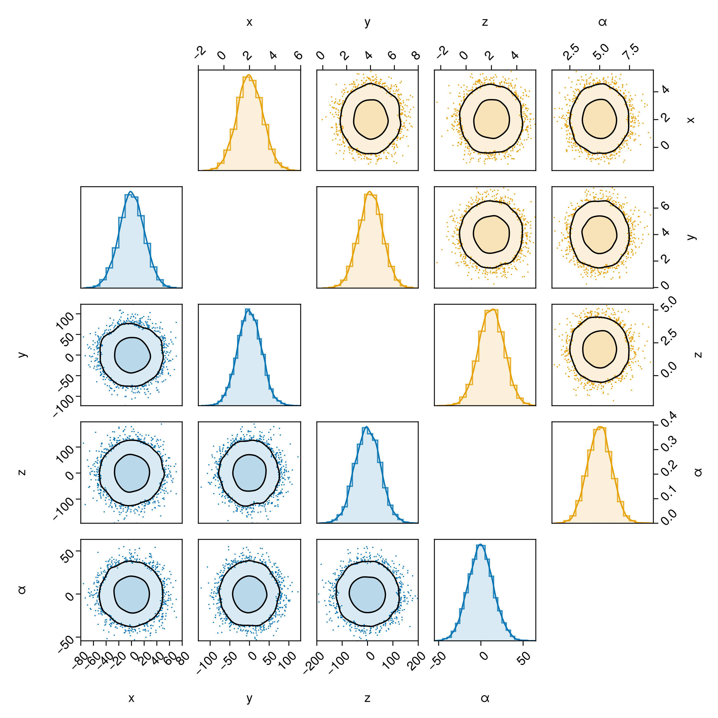
Finally, here's one more alternative layout to drive your readers mad:
fig = Figure(
    # You will need to adjust this yourself to make all the text etc.
    # the right size
    size=(800,800)
)


# Now the key part: call pairplot twice into different parts of the figure:
pairplot(
    fig[1,2],
    table1 => layers_series_1,
    # table2 => layers_series_2,
    bottomleft=true, topright=false
)

pairplot(
    fig[2,1],
    table2 => layers_series_2,
    bottomleft=false, topright=true
)

rowgap!(fig.layout,-70)
colgap!(fig.layout,-70)


fig